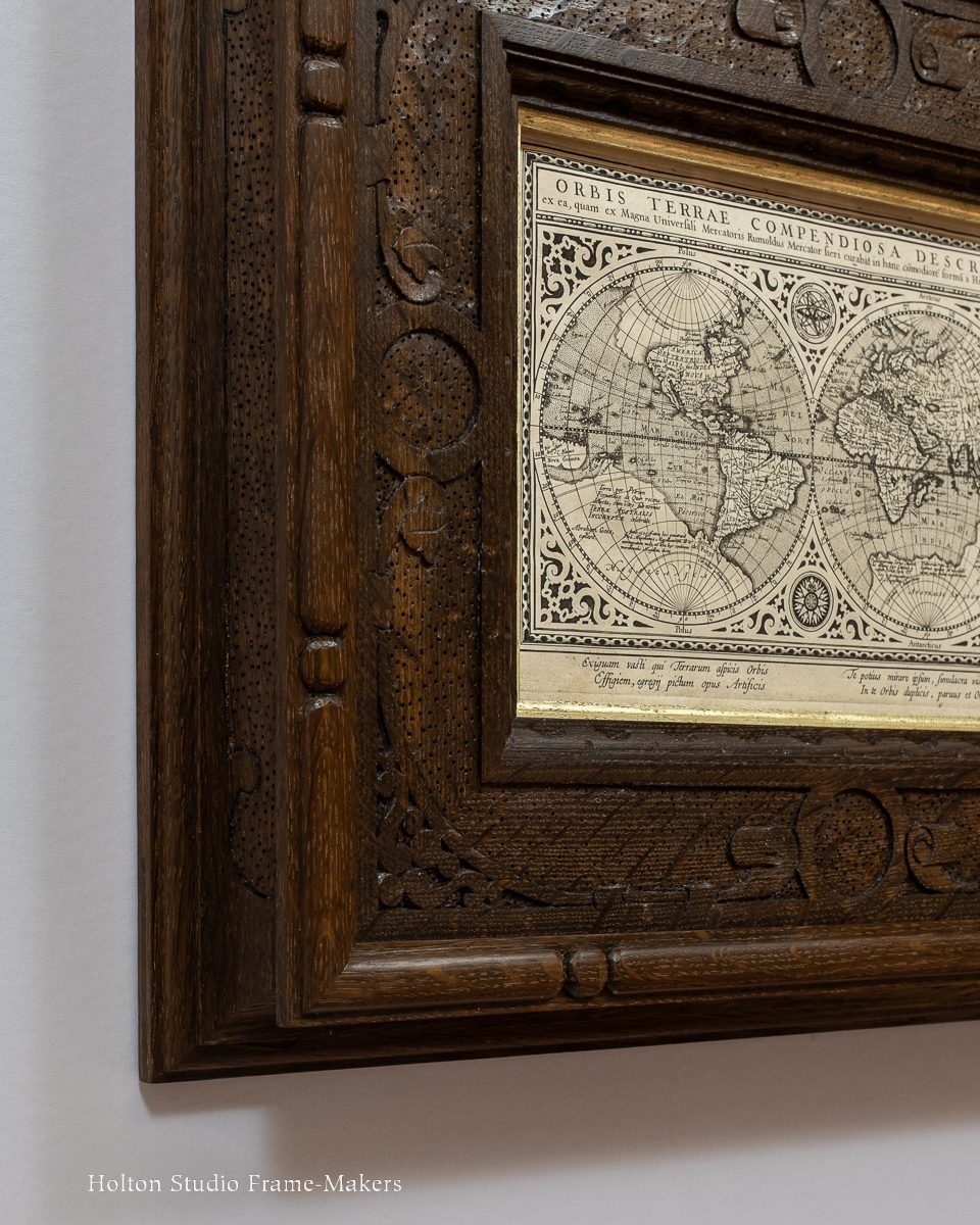
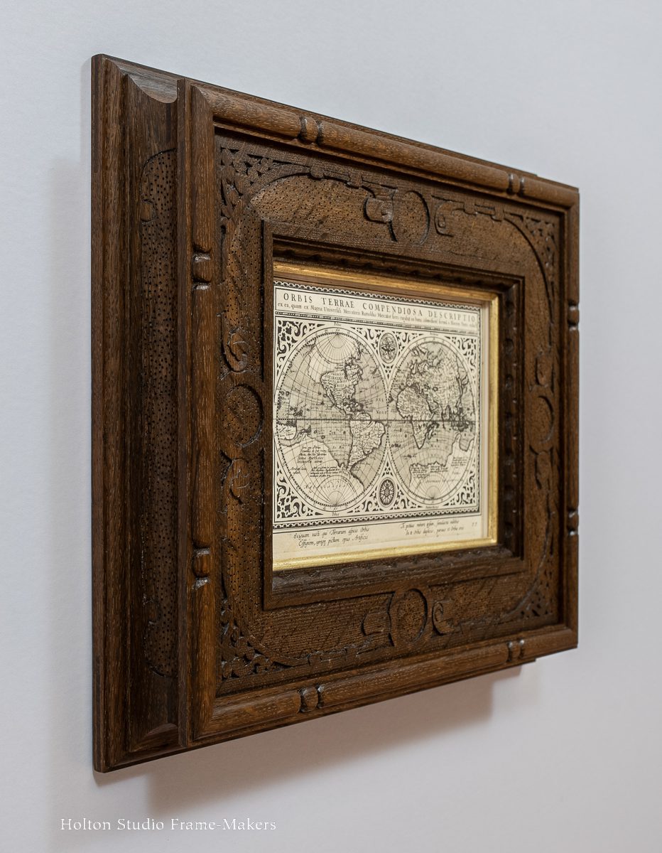
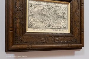
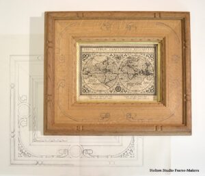
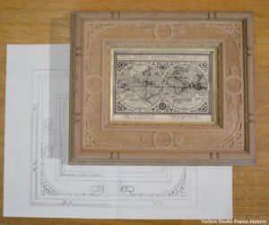
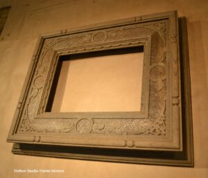
I just finished one of the more elaborately carved frames I’ve made—and I made it for a print that’s only 7″ x 9″. The map itself, though, is decorated with intricate strapwork, acknowledging that even a map of the world as small as this is worthy of lavish ornament—something to marvel at and celebrate and therefore adorn with beautiful patterns. 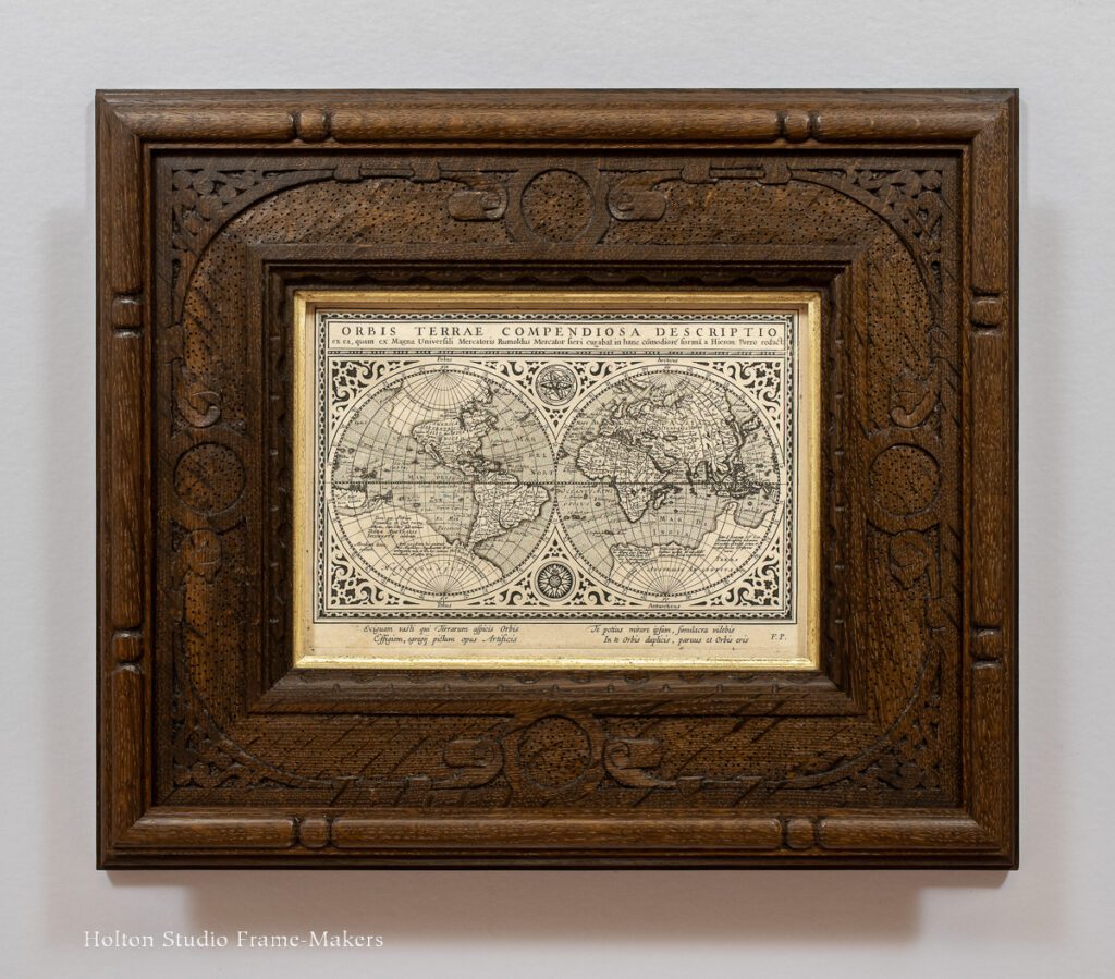
Titled “A Concise Description of the World,” this seventeenth century Dutch map represents the earth in two hemispheres—a “double world.” It’s taken from Giovanni Antonio Magini‘s 1617 edition of Ptolemy’s Geographia, and was printed in Arnhem, the Netherlands. Its significance, making it worthy of so much celebratory adornment, has to do with far more than the fact that it represents the world. The image of a double world bursts with significance and meaning, as its caption across the bottom margin suggests:
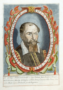
Giovanni Antonio Magini (exuberantly framed)
You, who look upon the tiny image of the vast globe of the earth, a painted work of the artist, rather, marvel at yourself; you will see in yourself the likenesses of a double world, and you will be a small world.
It’s a remarkably engaging appeal to the viewer, reflecting the exuberant, outgoing spirit of the Dutch Golden age that combined inquiry and wonder—that “marveled” at all that was being revealed, and the power of the arts to represent in miniature form the enormity of the earth. That age of discovery was itself a double world: the infinite wonders of the earth—matter—were being matched by new appreciation of the infinite wonders of human reason and imagination—mind—endowing each human being with the power to reflect on the external world and thus making us each “a small world.” Enabled by the revolutionary technology of printing and an international network of scholars known as the Republic of Letters, works like Magini’s helped spread a renaissance of human inquiry, imagination, cooperation and agency in the arts—a high point in what we might call humanity’s Great Conversation.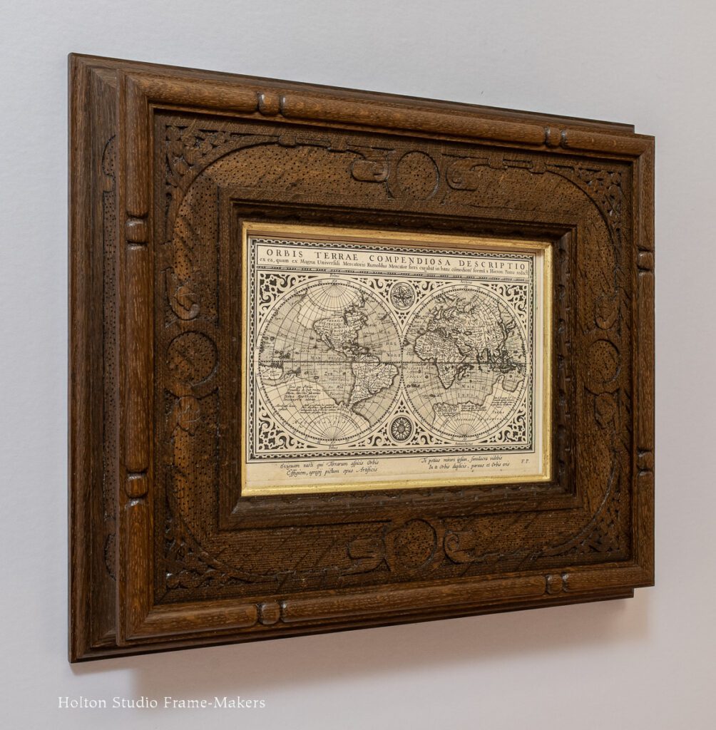 So while this may look like a map, it’s really an invitation, extended to us from four centuries ago, to take part in that ongoing Great Conversation. And not to simply observe and inquire but to “marvel” at this world of double worlds, of microcosm and macrocosm, of interconnecting, repeating and complementary patterns—to revel in its revelations and its communion.
Of course, my customer and I accepted the invitation. And we would do so by taking part in the print’s rich ornament that embodies its spirit of wonder.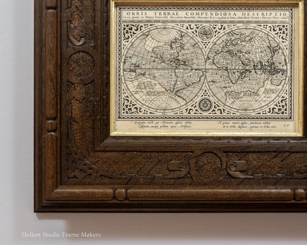
The frame is not a reproduction and we certainly made no attempt to deceive by trying to make it look like something it isn’t—an antique. The object was as it always is in frame making: to create a living and harmonious architectural place for the picture.
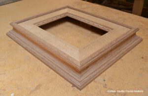
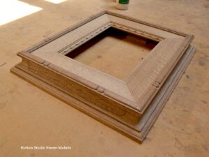
 Removed from the “frame” that is an atlas, a substantial place in the world, the map risked being overlooked and lost. Another way of saying that is that it would cease to matter. And we couldn’t have that. The face of the frame is 3-1/2″ wide, and the deep coved back sweeps out another 5/8″. More than 2″ deep, the frame provides the two dimensional image a place in the solid, three-dimensional world. It does not just surround the print but encases it. The frame’s massiveness, though, is mitigated by sustaining in its design the print’s fine decorative detail.
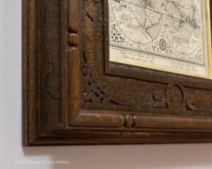
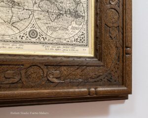
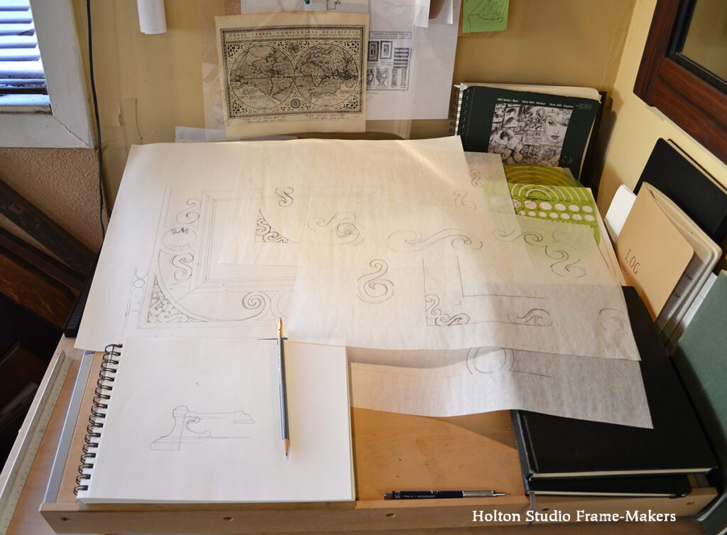
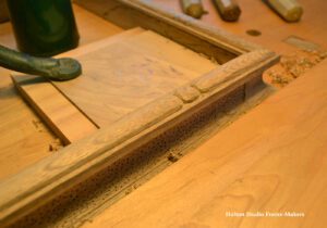
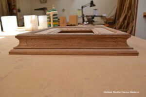
The design of the carved patterns came out of close study and response to the spirit of pattern-making and ornament in the print. This begins at the print’s border where it meets the frame. In another example of a double world, illusion encounters reality: the illusion, rendered with light and shadow, of a three dimensional carved ovolo molding strives to join and shape the tangible reality of the surrounding architecture the viewer occupies, and (after a brief interruption by the pale gold coved slip) the frame recognizes and fulfills this with an actual carved ovolo at its sight edge—and proves the efficacy of a 400 year old print’s enduring presence and power to touch us.The pattern on the flat is strapwork inspired by the dense ornament surrounding the map proper. Strapwork is a style of ornament that imitates ironwork and is also characteristic in vernacular wooden cabinetry of the time, so seemed natural for the woodwork of the frame. (Worth noting that, on the theme of world exploration and expansion, as well as repeating and interconnecting patterns, strapwork originated with Islamic girih, coming to Europe from the middle east, and sailed on across the Atlantic to adorn New England cabinetry.)
 For shapes, circles were an obvious theme. The map’s engraver, Abraham Goos, defined the oceans by stippling, which is a technique also commonly found in strapwork cabinetry and that made sense to adopt for the frame. I carved the cove of the dramatic cut-in back with a decorative line and stippled the enclosed field.
Fuming the oak darkened it substantially, and while the wood’s mellow tone harmonizes with the antique paper, its dark shade helps subordinate the frame to the brighter map, and allows the eye, naturally drawn to light, to concentrate on the print’s fine detail.
 John Ruskin said, “The function of ornament is to make you happy.” And in this case, it’s to make you answer the appeal of the map’s inscription and “marvel” at “this tiny image of our vast world,” and while you’re at it, at yourself as a wondrous reflection and microcosm of it—revel in the resonance and patterns of this world of double worlds. It is now our world, shared with and still hearing the echoes of the seventeenth century and the deeds of all ages and all humanity. Ruskin (as part in the Great Conversation) was passing through to us the profound lesson from those ages that adorned the world with their arts and decorated things like maps: People ornament for the same reason we sing and dance. Why on earth not heed that lesson?
Other seventeenth century maps we’ve framed may be found here, here, and here.
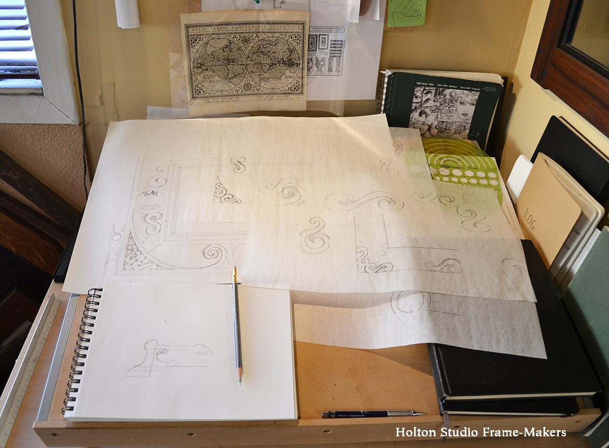
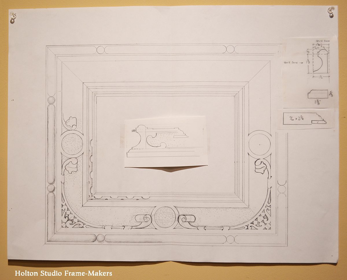
Scroll down for process shots.
—Tim Holton
Photos above by Sam Edie.
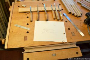
Process—
-
-
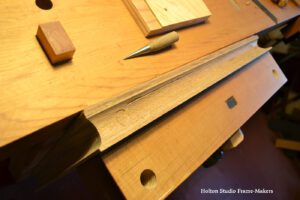
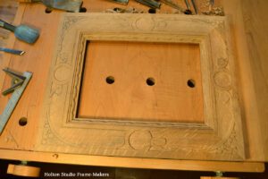
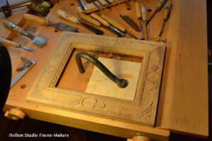
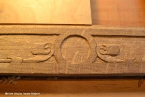
Early on, with only the sight edge carved.
-
-
-
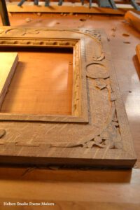
Ready to carve the back.
-
-
Stippling the carved back.
-
-
-
-
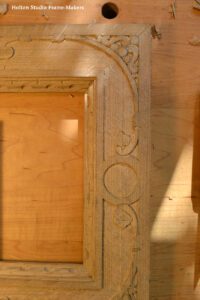
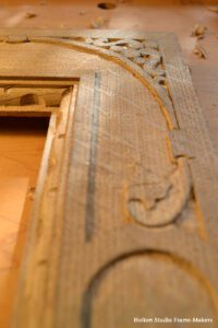
Ready to carve the flat.
-
-
-
-
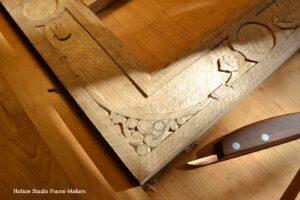
The corners are basically chip carved with the knife at the right.
-
-
-
-
-
-
All built and carved and ready to fume.
-
-
Fumed and ready to oil and wax.
 Another favorite is “Siena’s Sharp Left Turn,” 16-1/2” x 11″. It’s framed in a simple 2″ wide slope, No. 2 in walnut with clear oil finish, and has a coved 22kt gilt slip. More here.
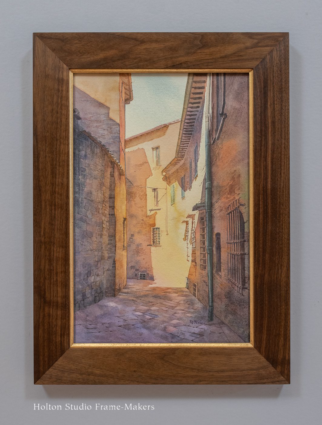
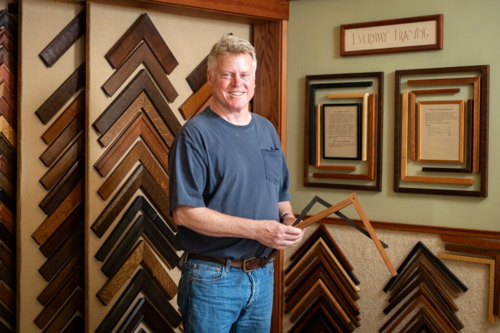
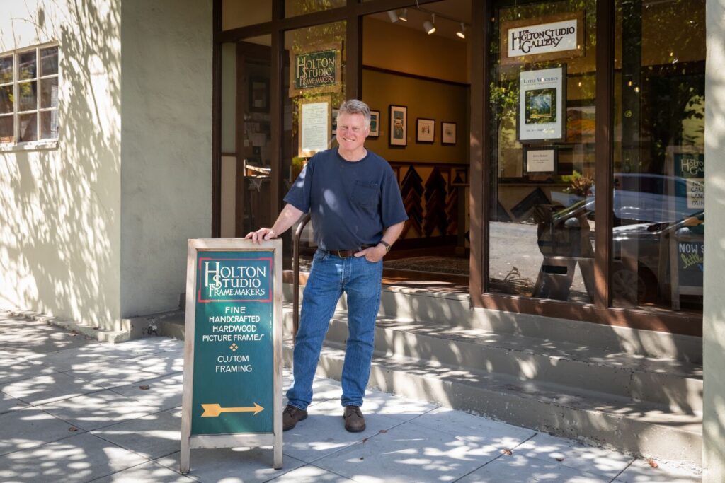
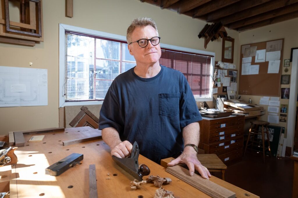
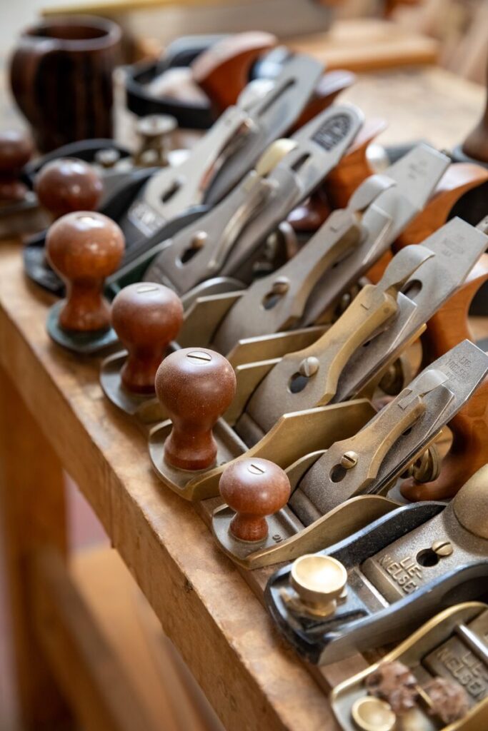
 Studio Tours—