Here’s a key lesson I learned a long time ago when I started looking closely at early twentieth century oak frames: while the shape of a frame molding should be alive to the picture, subtlety is 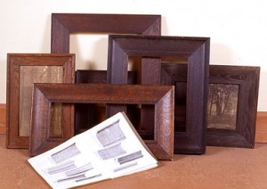 crucial to keeping the frame in its subordinate role. Following the example of the best Arts and Crafts era frame designers, we therefore typically flatten frame forms and elements a bit in deference to the flat plane of the picture and the flat wall the frame connects the picture to.
A good example of such a molding shape is a new profile we call No. 300 BC Low, which we just had knives made for. (These fit a molding head we use on a table saw.) The idea is to make the flattest perceptible concave molding shape. I’d call this a “dish” in contrast to a more pronounced scoop or cove. Of course the shape of the profile should always at the same time echo shapes rendered in the picture. But the subtlety adds another benefit having to do with harmony: it is by virtue of its contrast to the complementary adjacent flat picture and wall that the shape reads. If it were more dramatic, it wouldn’t need the juxtaposition to a contrasting flat plane for our eyes to 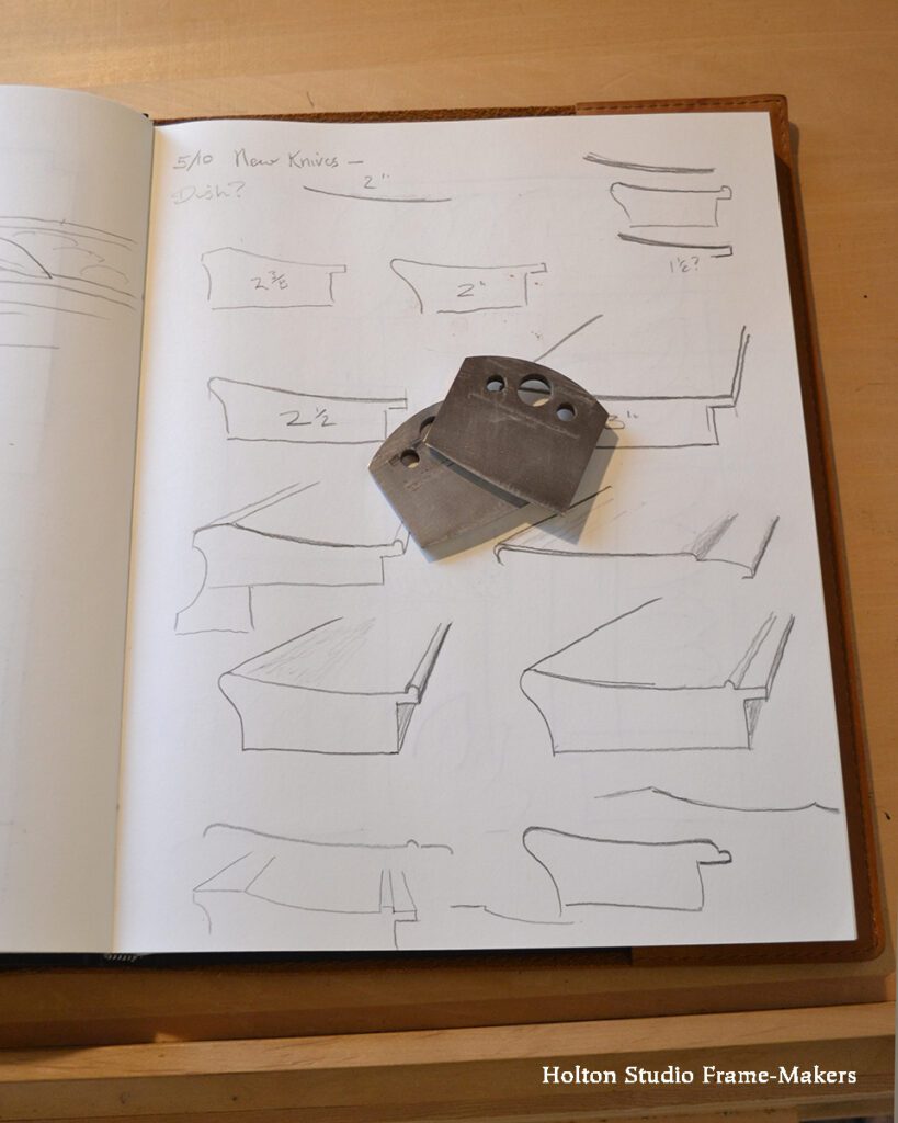 register its character. Its interest, in other words, isn’t in the frame alone, but in its interdependent relationship with those flat forms. Flatness and 3-dimensional form complement—that is, they complete—each other. They need each other.
Just that slight curve, along with the cut-in back, gives the profile grace and makes it feel much lighter than a plain square molding, like the No. 1, at the same width.
We made the No. 300 BC Low corner sample below in fumed quartersawn white oak finished with linseed oil and wax. The knives are 2″ wide, and that’s the width of this sample, but they can also be used to mill a narrower molding or as part of a wider profile, either by adding other elements or simply stretching out the flat. In the photo at left, showing the knives on a page of my sketchbook, you can see how I’ve begun drawing possible profiles using these knives, often combined with other knives.
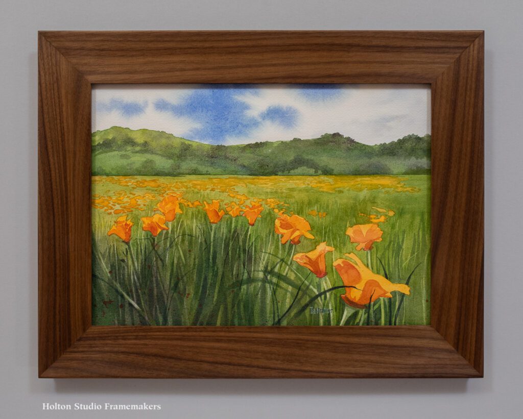
Tia Kratter‘s “Rebirth” (below), which is in our current show “California Wildflowers,” cried out for just such a profile, so it received our first frame made with the new knives. The shape suits not only the broad flat field but also the distinctive long gentle curves of poppy pedals.
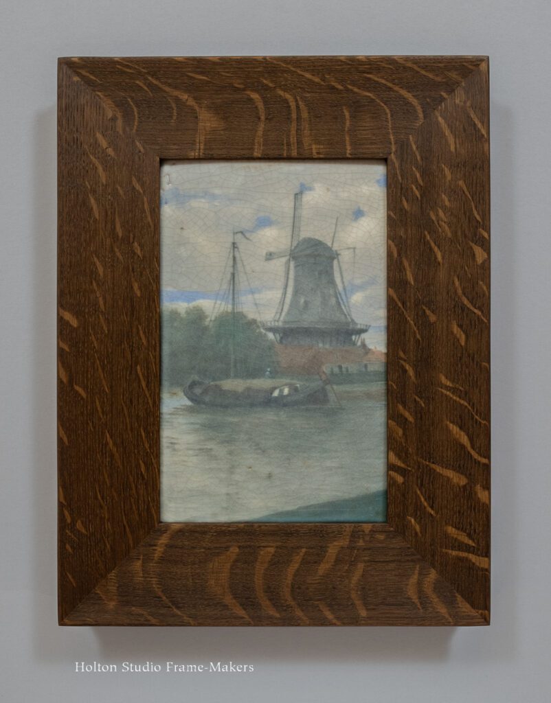
We made Tia’s frame, above, in walnut. As I said, because the cove goes to flat, that portion can be stretched out to make profiles wider than 2″—which is what we did for the fumed quartersawn white oak frame on the 1912 Carl Schmidt Rookwood tile, below. This piece offered the perfect opportunity to echo the forms of the boat and the windmill while staying subordinate to Schmidt’s quiet and muted treatment of the scene.
Those wonderful old frames inspired by the Arts and Crafts Movement came out of a special understanding of the natural unity and harmony of the arts, and in particular between pictures and architecture. Nineteenth century frames had become absurdly ostentatious and pretentious, reflecting an increasingly arrogant position and status for painting as separate from the other arts. Reformers turned to a humbler presentation of pictures, and relied on simpler frames, frequently made in beautiful oak, to restore pictures to a more harmonious role as just one of the many allied arts—no one of those arts standing alone but each made more beautiful by its complementary relations to the others and its service to the whole architectural setting.
—Tim Holton
« Back to Blog
These are beautiful, Tim. I love finding your latest blog in my inbox! It’s better than Christmas!
Very kind of you, Ali! Thank you!
Such a beautiful profile, and I love your entire presentation of this new offering! Sketchbook genesis, optional extras, finished examples, making process–so thoughtful and perfect.
Brava!
Thank you, Leslie! So good to hear from you!