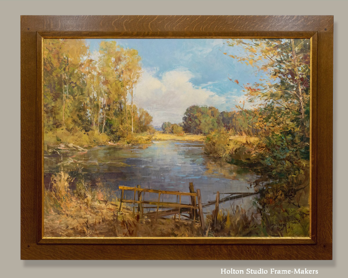
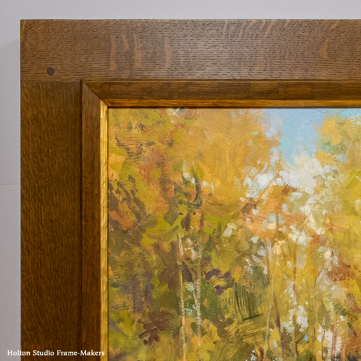
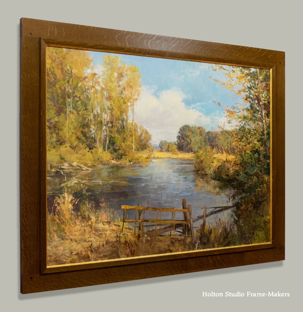
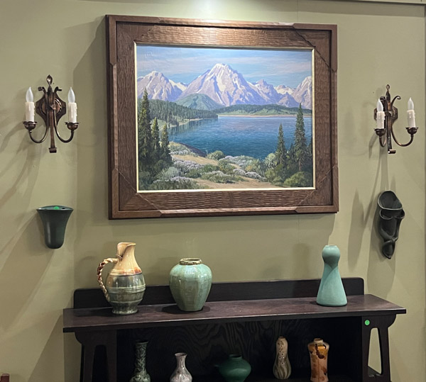
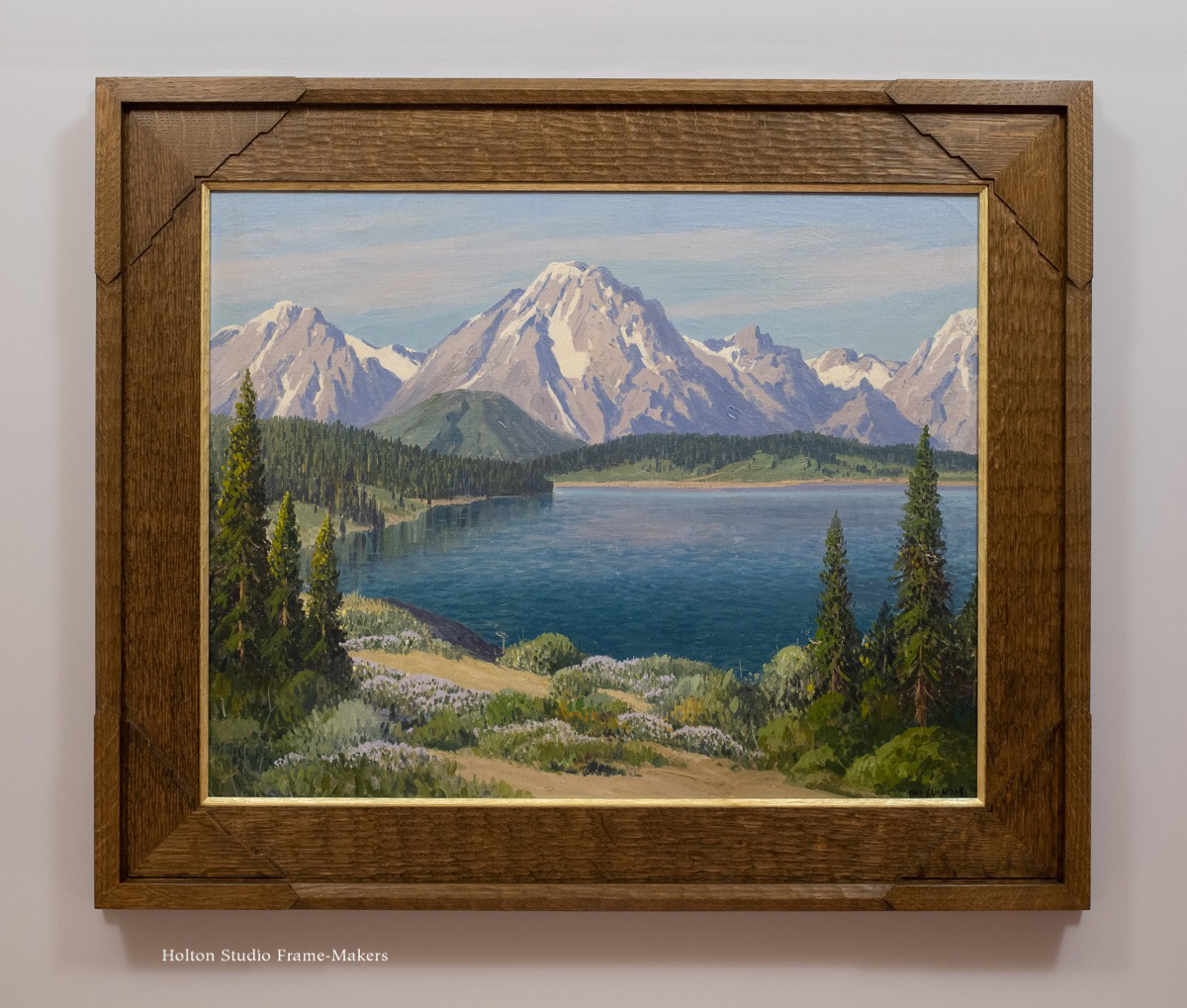
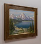
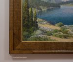
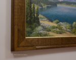
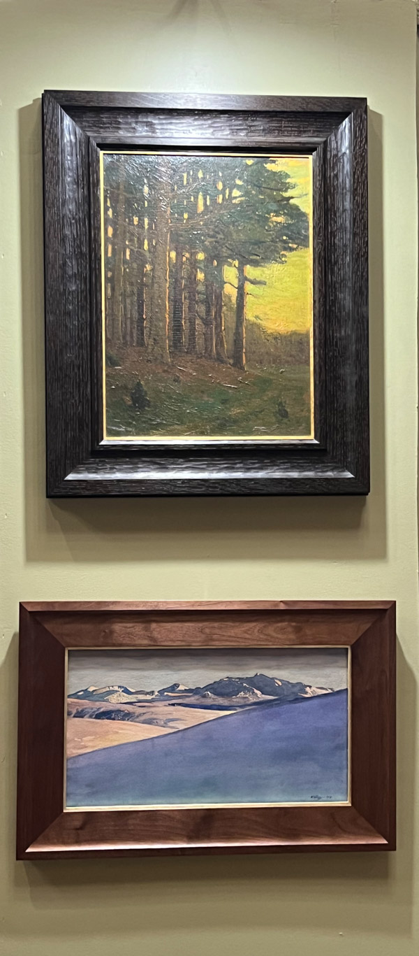
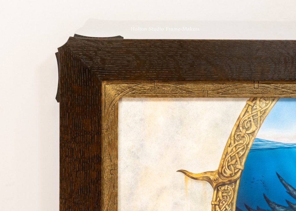
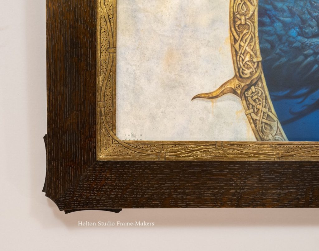
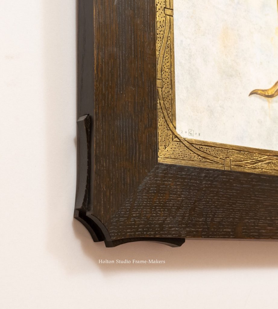
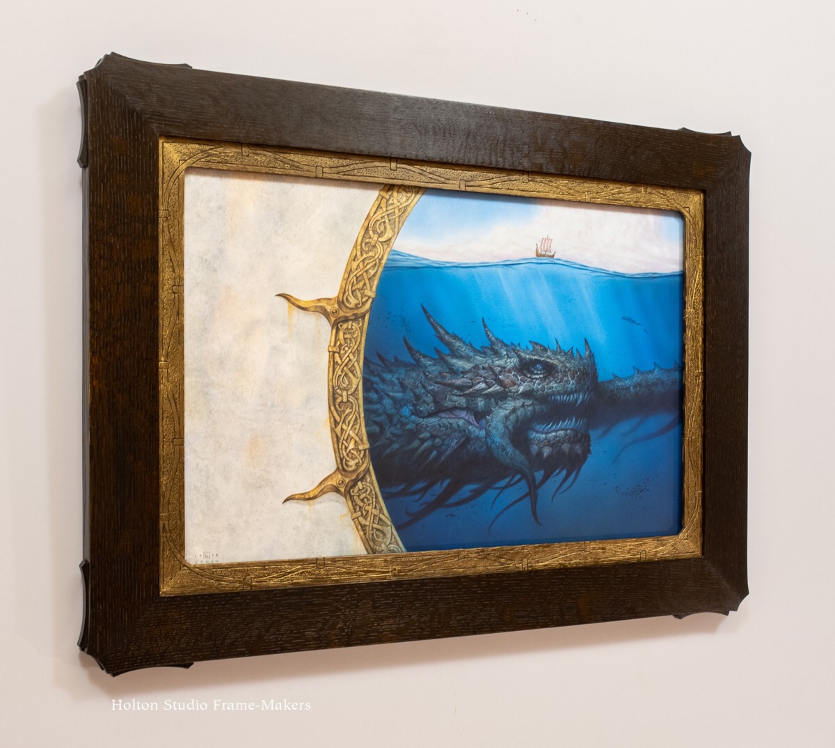
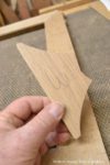
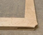
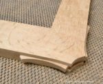
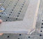
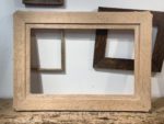
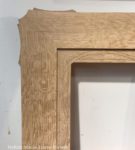
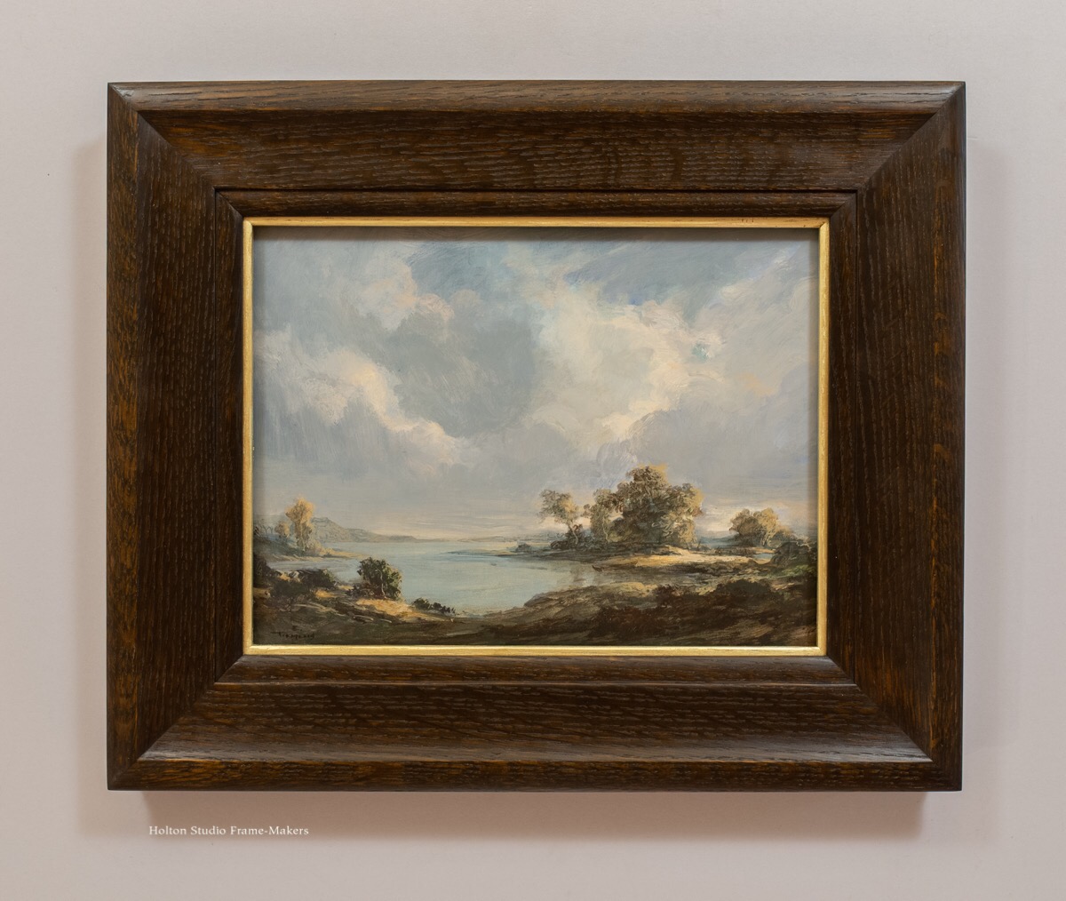
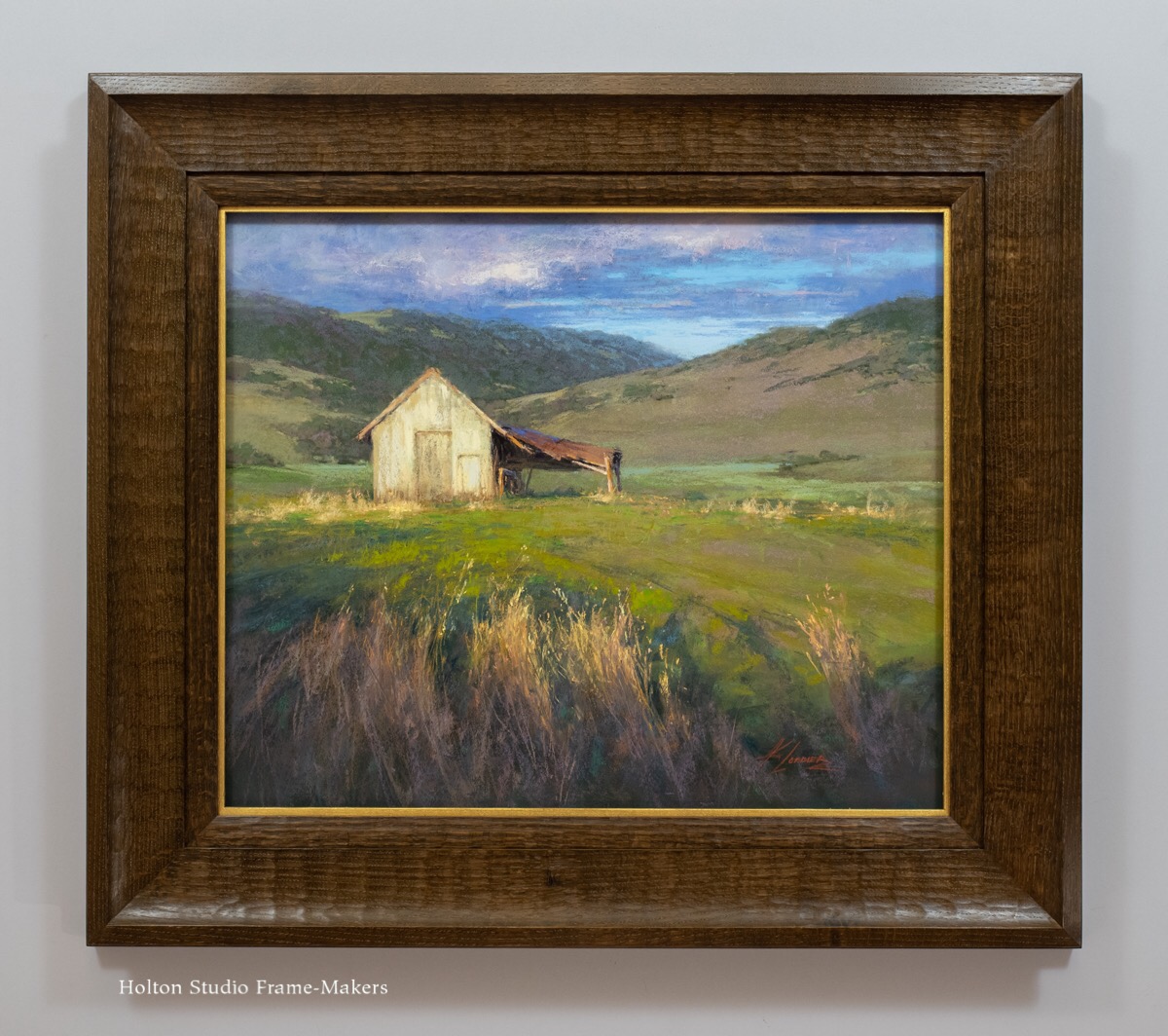
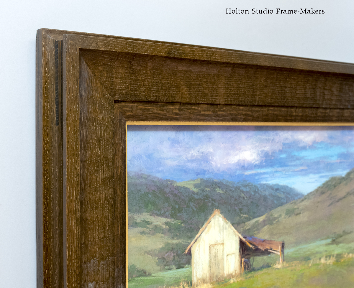
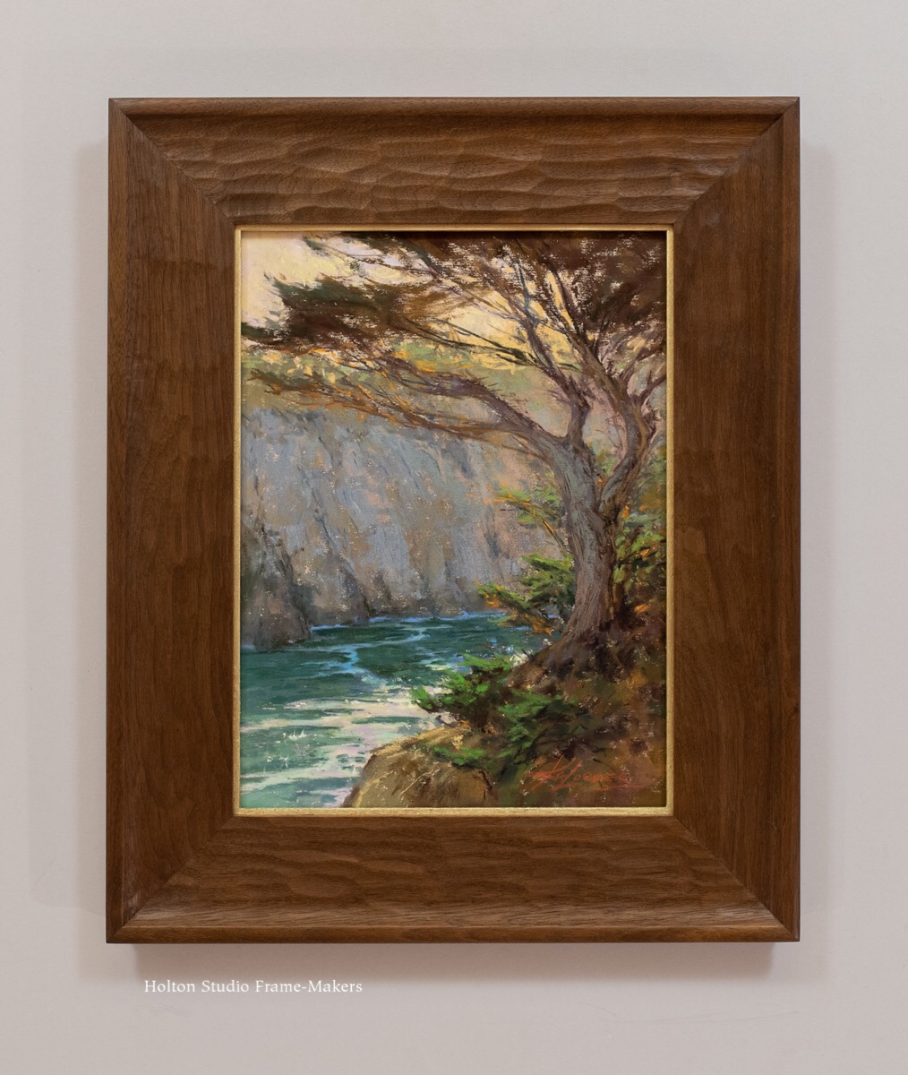
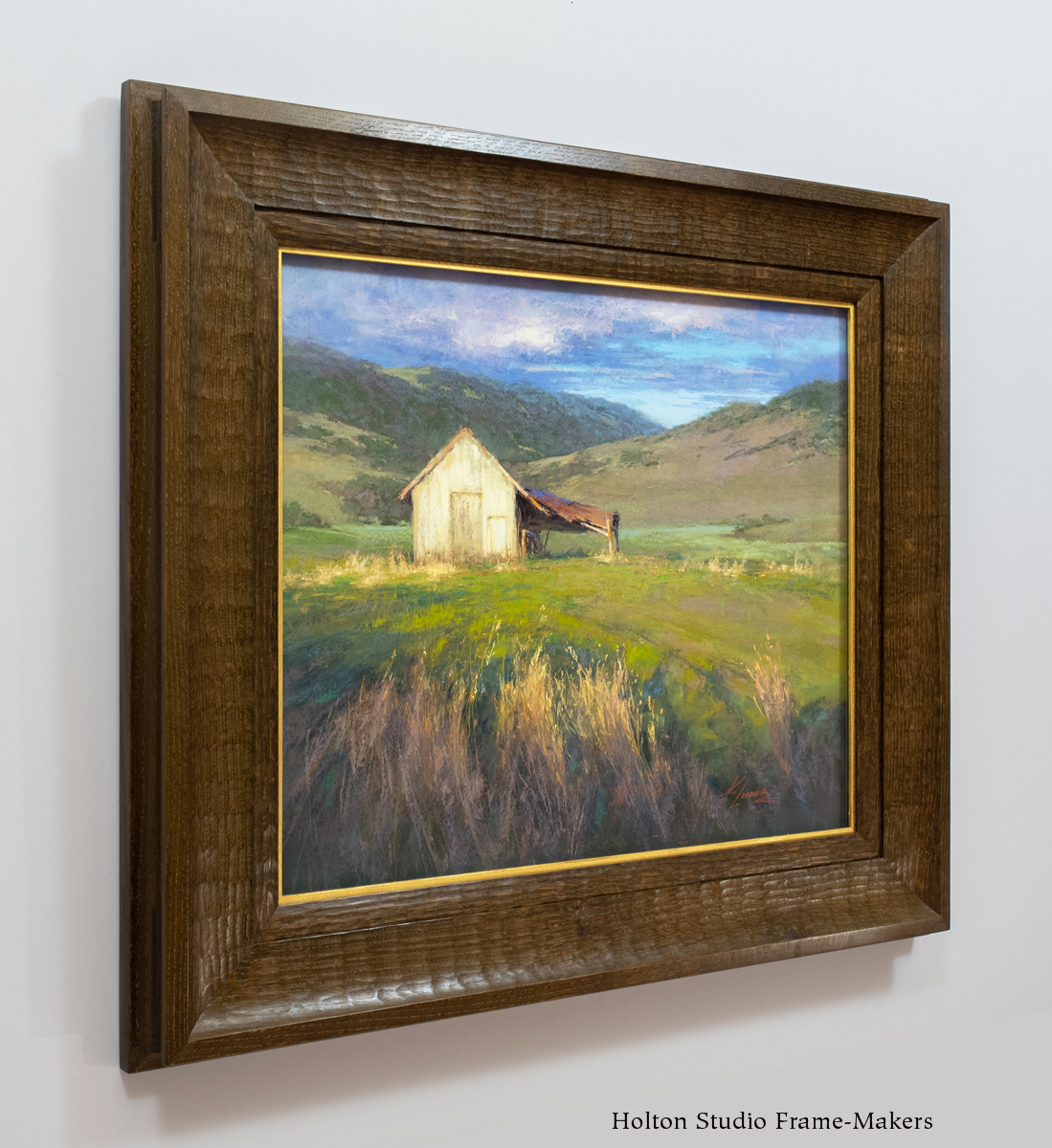
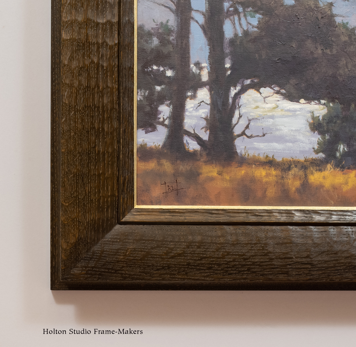
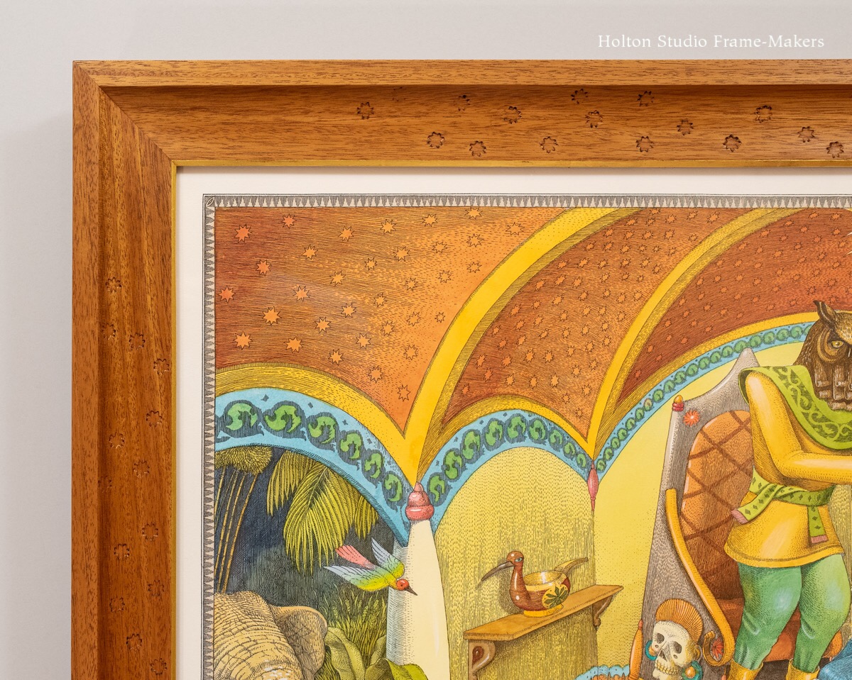
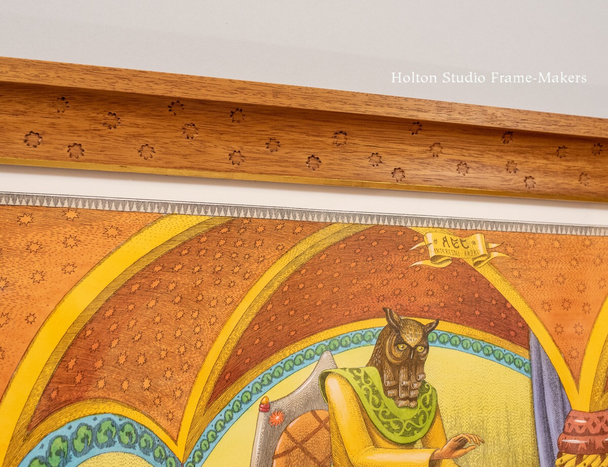
There’s something uniquely rewarding for us in framing Erik Tiemens‘s paintings. The first three here, brand new for Beloved California VI, we set in quartersawn white oak with Dark Medieval Oak stain and gilt slips.
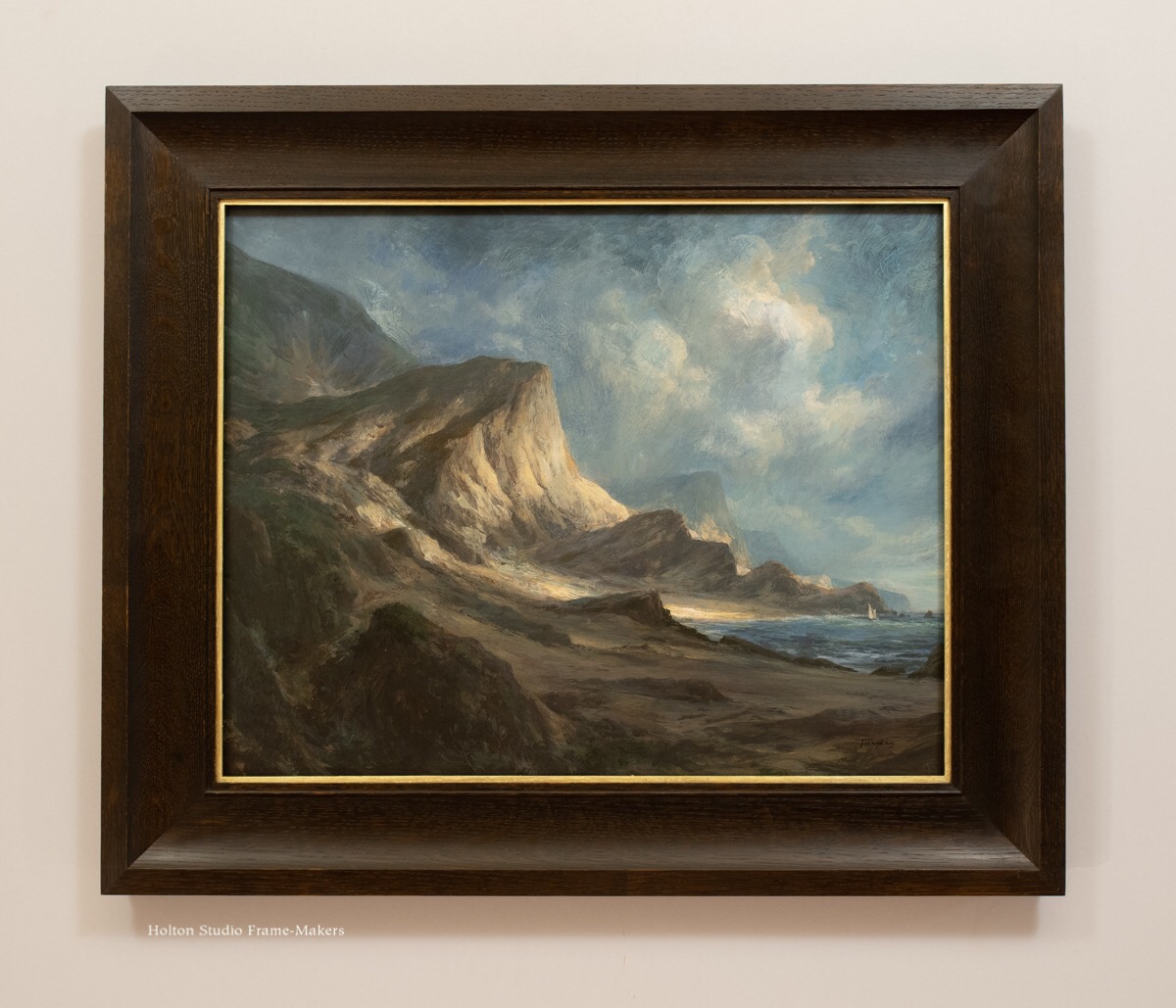
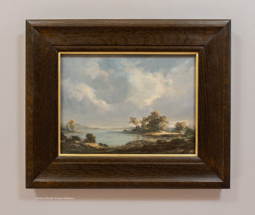
Erik Tiemens, “Cliffs Before the Farallons,” water-soluble wax paint on wood panel, 16″ x 20″.
Why are Erik’s paintings so rewarding to frame? For one thing, his depiction of form always offers something to inspire the shape of the profile. The artist loves to let his imagination play with clouds, the land, and its features—”Cliffs Before the Farallons” being no exception. (It was fun to let the dramatic sweeping coastal geology shape the frame into a nice scoop.) A vigorously creative conversation between his own native California and those landscapes of his artistic forebears in the genre gets filtered through Erik’s masterful rendering skills with which he so beautifully defines gradations.
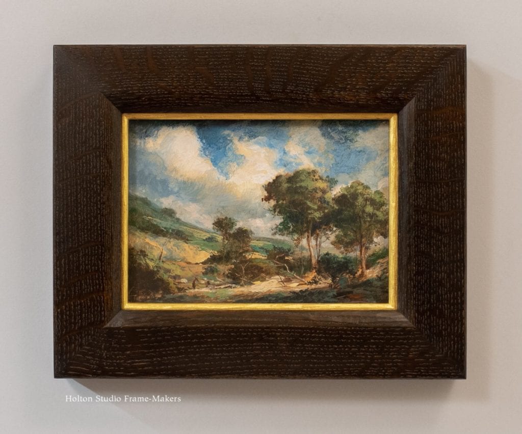
Erik Tiemens, “Gainsborough’s Path,” water-soluble wax paint on wood panel, 9″ x 12″.
And then there’s the painter’s exceptional ability to paint light that makes the complementary shadow effect of dark wood frames so satisfying to the eye.
There’s also the fact that he and I are so sympatico in regards to the whole understanding of tradition as something to which we belong, and as a great vital well that truly belongs to us all—a view that (contrary to what many seem to believe) is an immeasurable source of creative freedom.
While Erik’s work in the film industry has placed him on the cutting edge of technology, it’s the way the artist revels in art history that best explains his creative genius. That aspect is the focus of an excellent interview with Erik last month in the online art magazine Boldbrush. Below are a few excerpts, beginning with his earliest artistic influences.
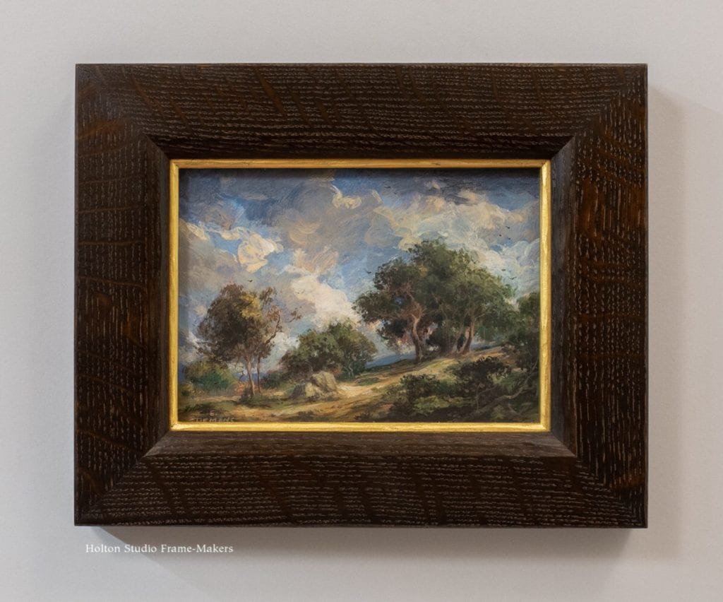
Erik Tiemens, “Lagoon of Tranquility,” water-soluble wax paint on wood panel, 9″ x 12″
“I was very fortunate to have a childhood surrounded by art and music… My mom was a ballerina, so I was constantly exposed to dance and classical music as a kid.
At one point she did flamenco dancing as well, so there was a wide variety of cultural influences. There’s something about the rhythms of elaborated concentration in Bach and Mozart that made me want to tap into creativity and make something that was just as beautiful, intuitive, and focused. My expression found itself in the visual arts rather than music, though – when I was seven, my family moved from Los Angeles to the Santa Cruz Mountains and I remember distinctly the change in the light from one place to the other, from the brilliant blown-out light of LA to the cool tree-dappled light of Redwood country. I remember the way the sun would reach over the valley – that strong awareness of light as a sense of place has stayed with me ever since.”
Erik Tiemens, “Pastoral Spring,” water soluble encaustics on wood panel, 5″ x 7″.
Erik, like several of our artists (including Terry Miura who first told me about him), studied at Art Center College of Design, during which time he landed an internship at Disney doing animation layout.
While he enjoyed the work, during his time there he got to see the work of the background painters and realized that was what he really wanted to do. “I was going outside to do plein-air studies on my lunch breaks anyways, and I realized that the background painters were really just doing landscapes—I thought that was an awesome job, painting landscapes for your day job.”
It was just the first step in a stellar career in film and animation. And I do mean “stellar”: Erik went on to work for George Lucas’s Industrial Light and Magic, where he played a key artistic role in the making of several Star Wars movies.
But [Erik’s always] also wanted to paint as a fine artist, and over the years he has consistently maintained both traditional painting and digital concept art side-by-side as complementaries. “Painting for film design is a very similar skill set to plein-air; you have to work rapidly, catch the light, look at the big shapes and patterns. Over the years I’ve maintained a fairly rigorous plein-air painting practice – I paint outside every week – and I use the knowledge from these studies to inform my concept work as well as my studio landscapes.”
The influences Erik cites reveal him as an artist of enormous artistic appetite. Inspirations he lists include George Inness, Claude Lorraine, Richard Wilson, John Singer Sargent, Joaquin Sorolla, Anders Zorn…
The Impressionists, the Hudson River School, Turner, Constable – the list goes on and on. “In the past ten years, I’ve been going back to the old masters a lot. Van Ruisdael, Rembrandt, Meindert Hobbema. My father is from the Netherlands, so that curiosity to connect to the past is very personal in the case of the Dutch painters. I really love the play of light and dark that is traditional in the Dutch landscape – the clouds casting patterns of shadow on the landscape, the way the composition draws your eye in and through the piece. A few years ago I went to the Netherlands and spent ten days doing a deep dive into the Dutch landscape—hours at the Rijksmuseum, hours roaming the countryside and just geeking out over the way the light and the feel of the land is exactly the way the masters captured it in their work.”
Erik frequents art museums because, he says,
Erik Tiemens, “Dance of the Clouds,” water soluble encaustics on wood panel, 5″ x 7″
“There’s the ‘You are what you eat’ aspect – as an artist you have to immerse yourself in good art in order to create good art! But aside from the aspect of learning technique and style, art history is so important to study because it’s the story of our humanity – every part of culture is filtered through an era’s artwork. I’ve been thinking a lot about the context of landscape painting in our current culture and climate. If you think about it, our national landscape is changing rapidly; the West Coast is increasingly dry and burning, while the East coast is becoming more tropical. In the context of climate change, landscapes become a very precious thing and as a painter I get to remind people of that fact.”
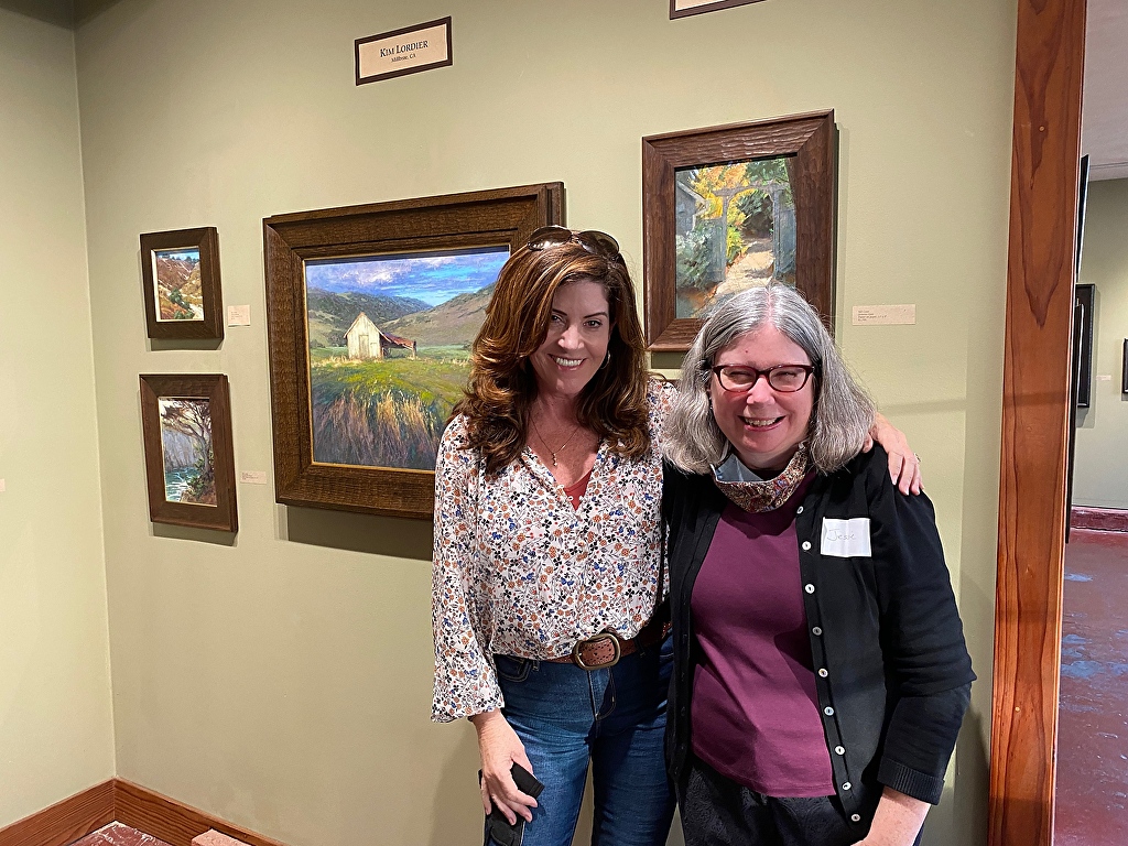
Precious indeed. Erik Tiemens perfectly expresses the spirit of Beloved California VI, running through December 30. Come see Erik’s paintings in person.
Read the whole Boldbrush interview, here…
Visit the artist’s page, here…
Learn more about Erik, including the water soluble encaustics he paints with...
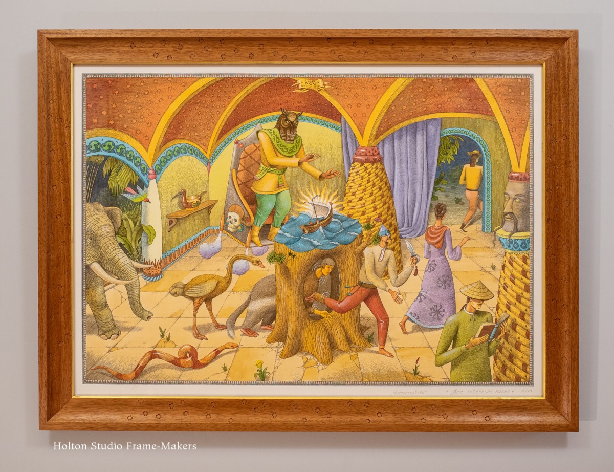
 The picture portrays humanization as not only evolutionary. For this muralist with a degree in architecture, humanization evidently has much to do with the art of building and the many arts it shelters. Such making, after all, makes us human—humanizes us. Conversely, acts of war and destruction are our unmaking, our dehumanization.
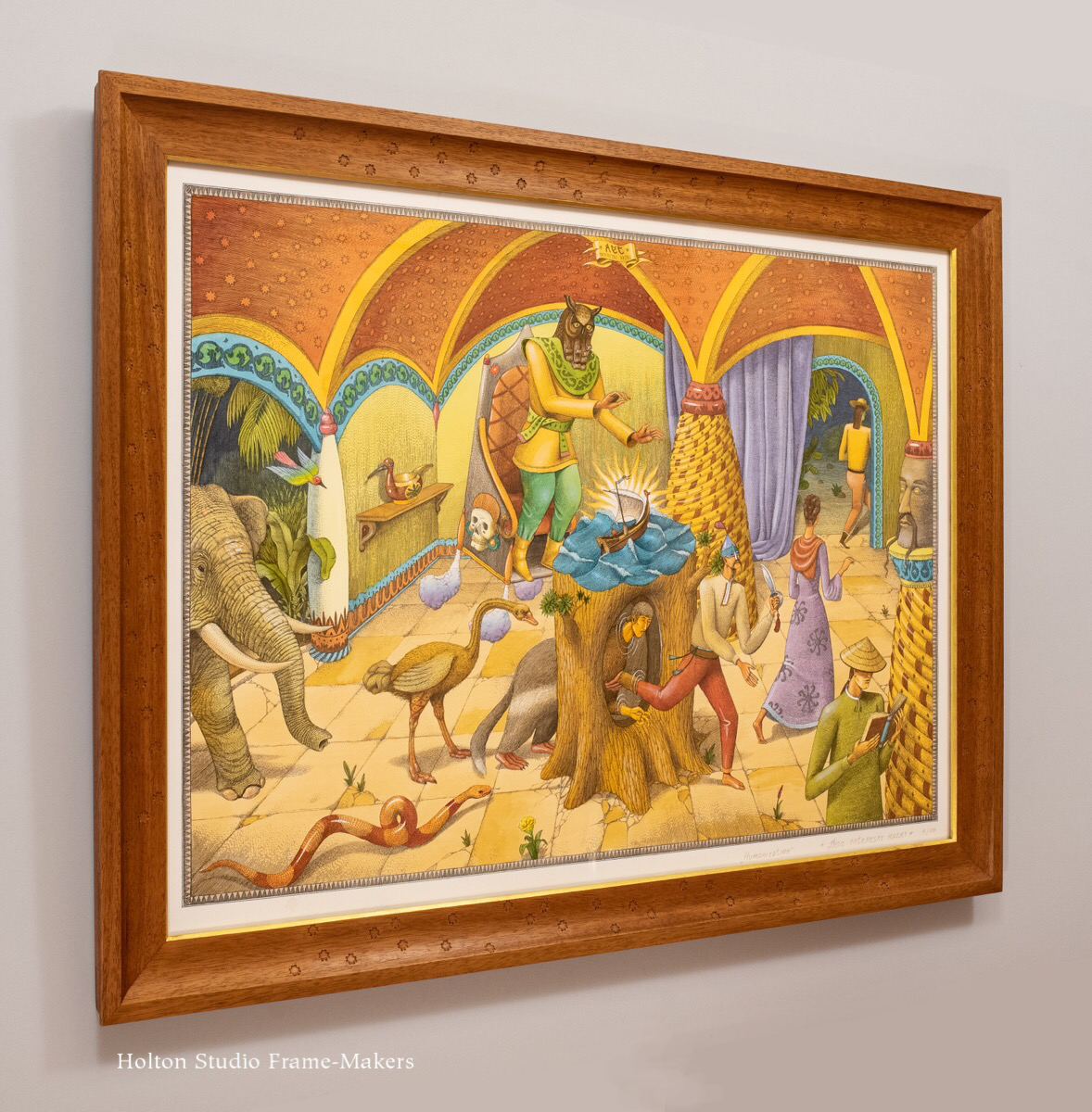
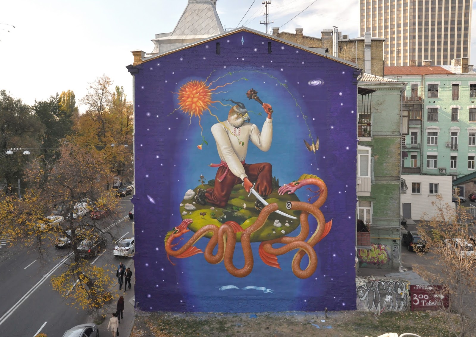 After earning a degree in architecture, Aleksei Bordusov’s artistic career began in earnest in the early ’90’s when, according to his website, “he started painting on the streets of Kyev as part of a graffiti crew.” He eventually became a muralist and now has murals all over the world (including several in the US).