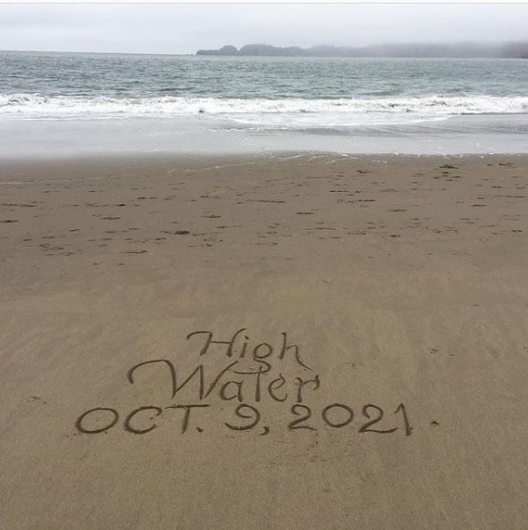
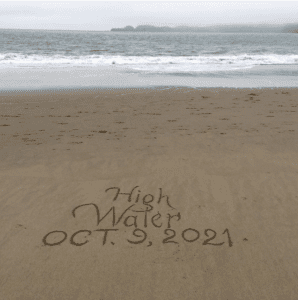
I’m very happy and excited to announce our next show, High Water: Works by Karima Cammell. The show will open with an artist’s reception on October 9 (scroll down for details) and run through October 30.
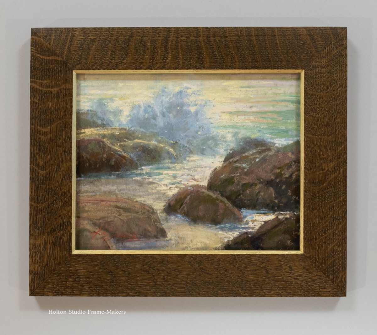
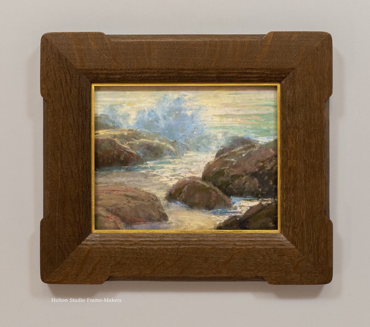
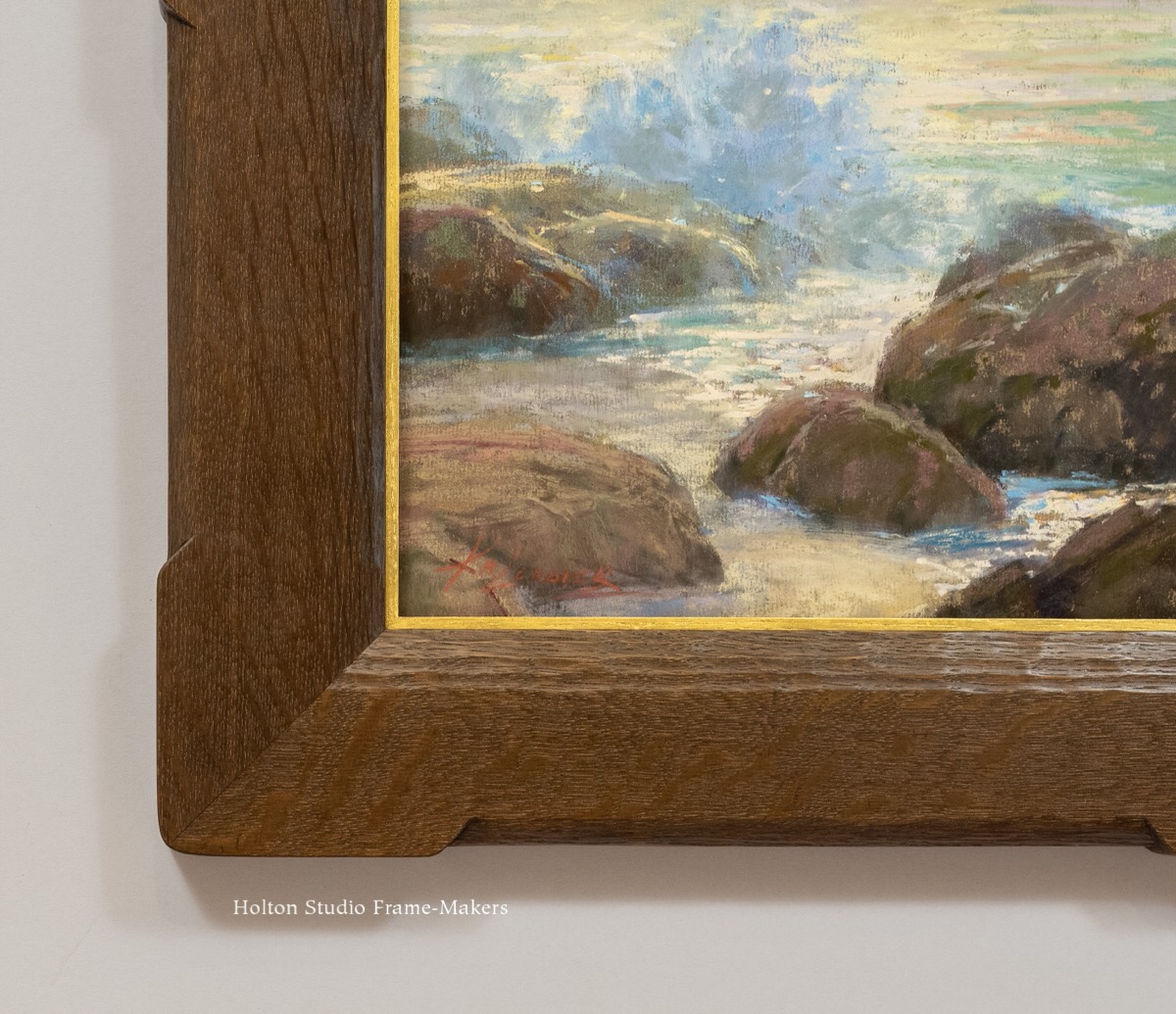
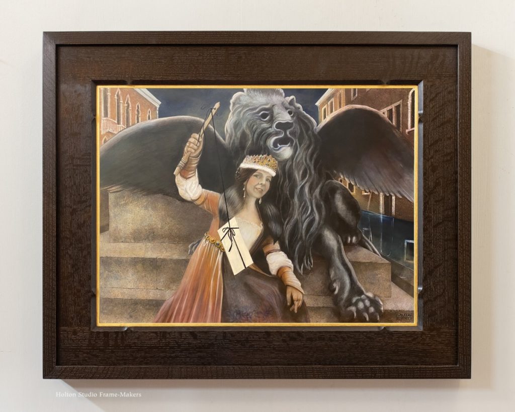
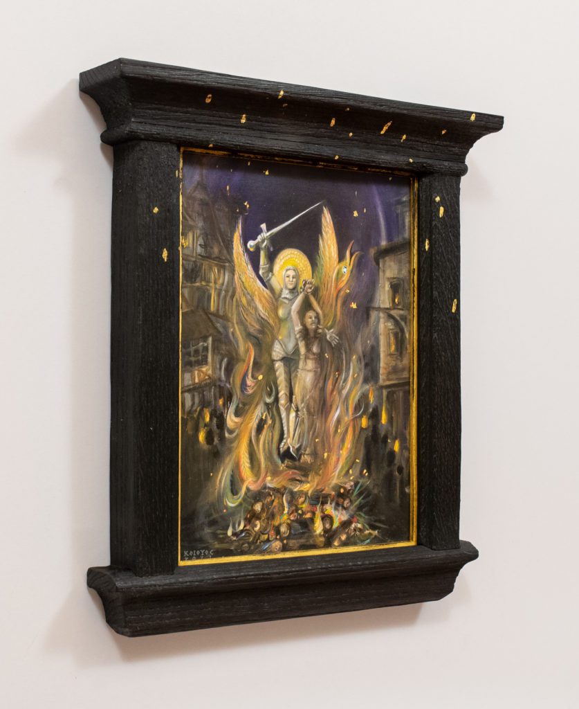
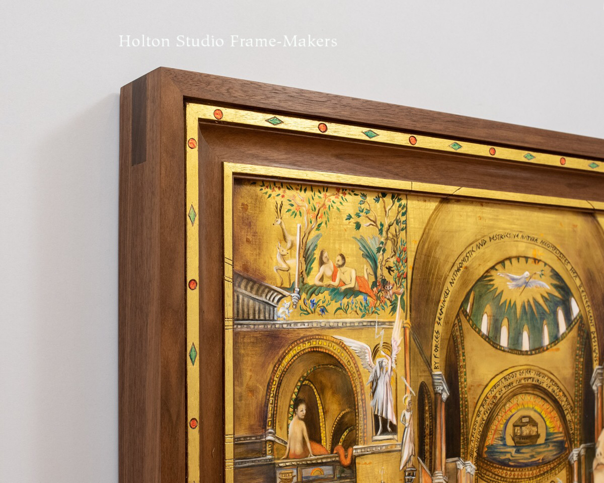
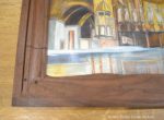
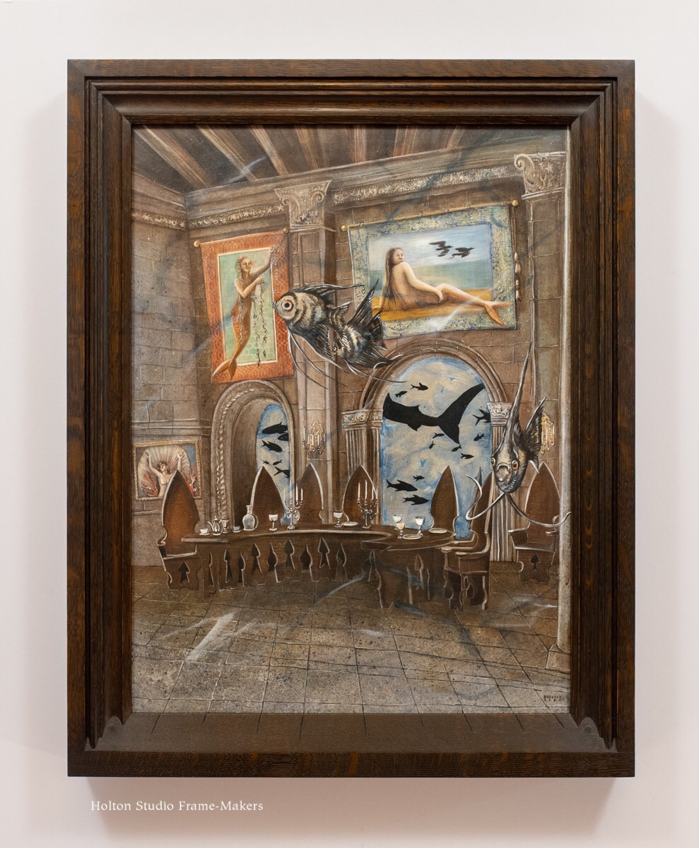
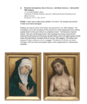
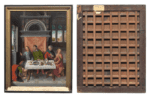
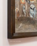
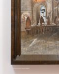
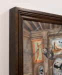
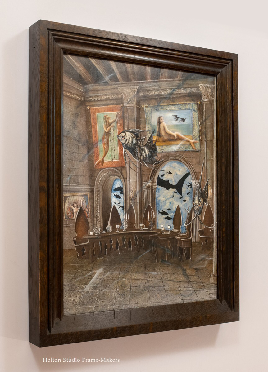
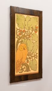
In addition to being a painter, Karima Cammell is an author, teacher, and entrepreneur, and the proprietor of Castle In the Air, a studio on Fourth Street around the corner from us here in Berkeley. Karima is a formidable force of creative energy and influence—and, simply, a wonder. So I can say that it’s a joy and privilege to have been framing her work the last few years. (Pictures and links on those may be found at the bottom of this post.) Lately, she’s been mastering the difficult medium of egg tempera; one example being “Venise” (18″ x 24″), below.
 The powers of such art forms, animated by and animating the artist’s imagination, are now summoned to respond to an increasingly perilous world. Karima Cammell writes,
 In 2015, at 41, a confluence of chemical imbalance and stress caused my mental health to become untethered. I woke up flooded by night sweats, tears, terrifying news, and noise.
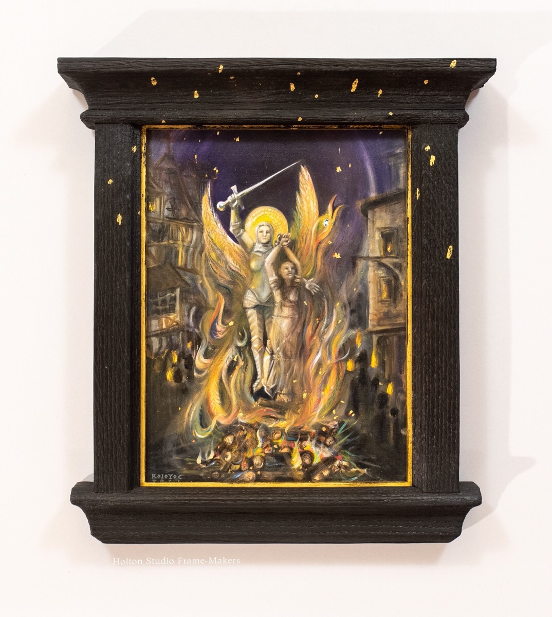
HIGH WATER illustrates one woman’s vision of the changing shoreline as she becomes unmoored by internal tidal shifts. Looking for a place to land she scans the shore, finding a world both on fire and drowning beneath waves of social, political, and climate change.
To save herself she becomes a chimera—a fire-breathing monster with scales and wings—armored and able to swim and fly. The magic to transform herself comes from love.
In my crazy philosophy the power of transformation is the old magic that makes us human. Transformation can be as simple as turning apples into applesauce or as complex as facing the discord of anxiety and fear and retuning it to harmony and wellbeing.
When we add the power of imagination to this old magic we discover art, a power that makes anything possible.
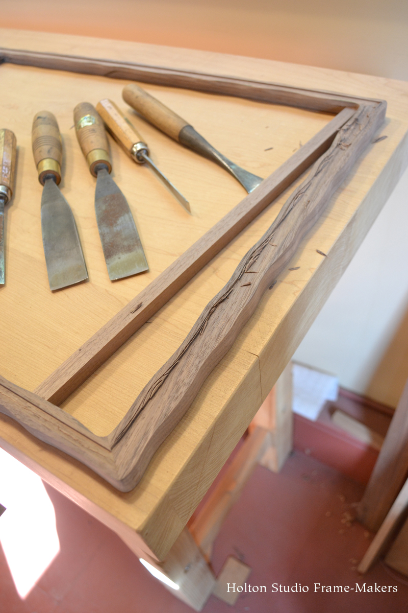
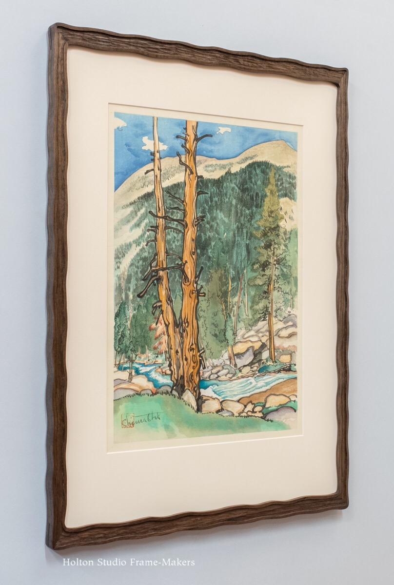
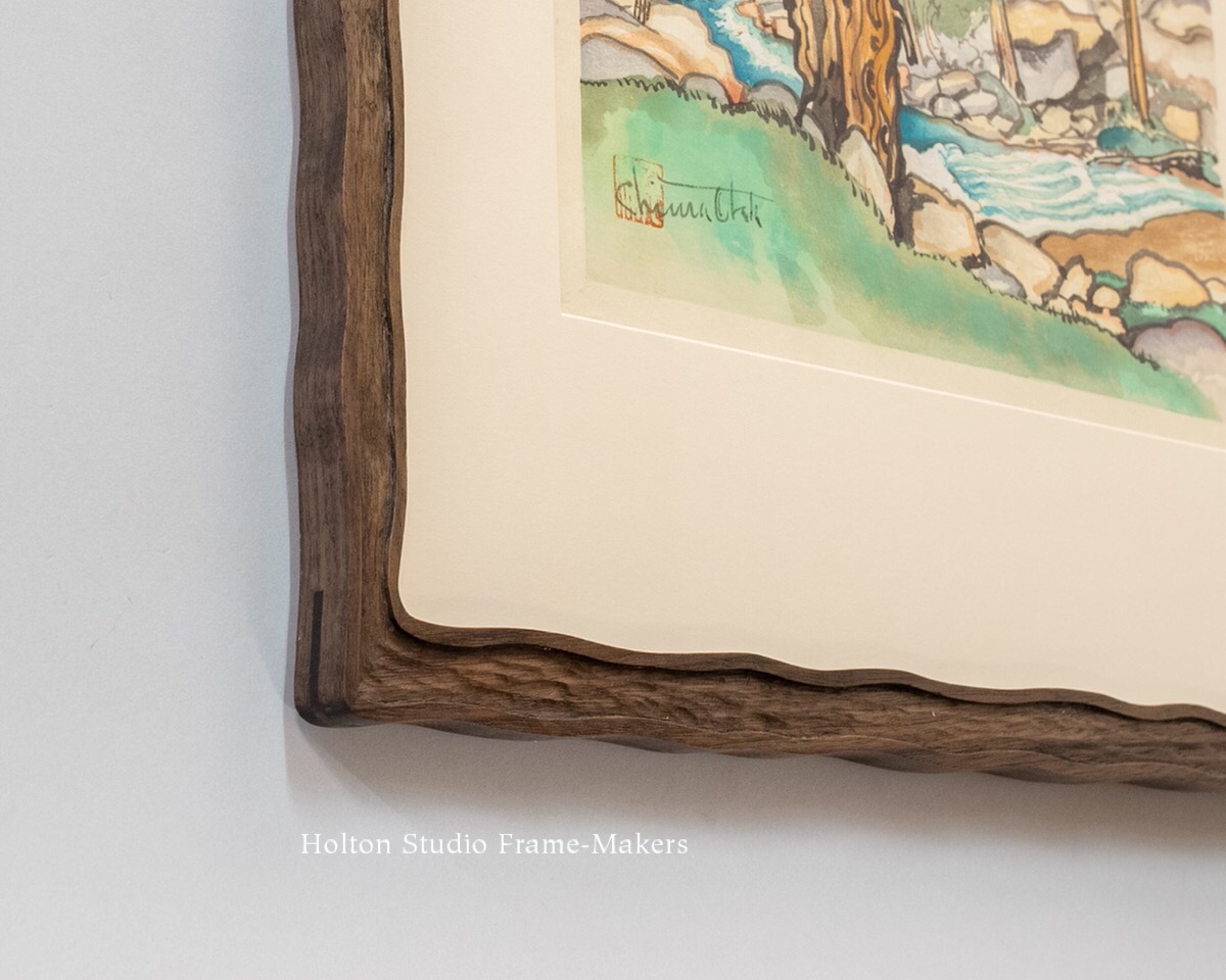
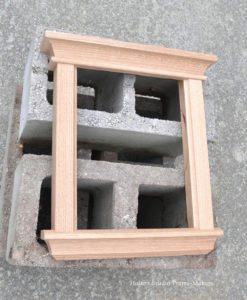
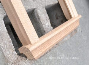
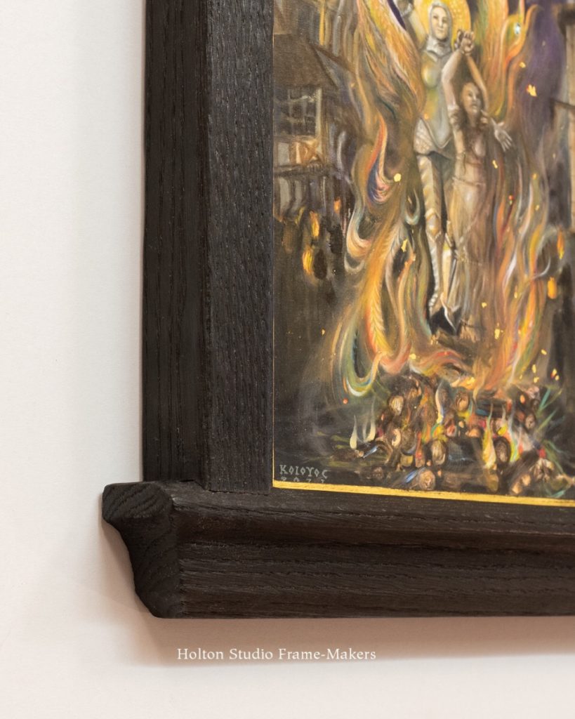
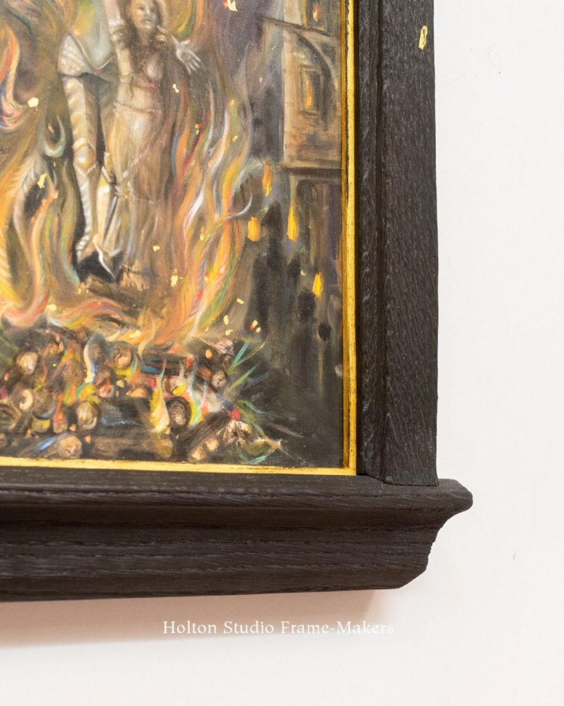
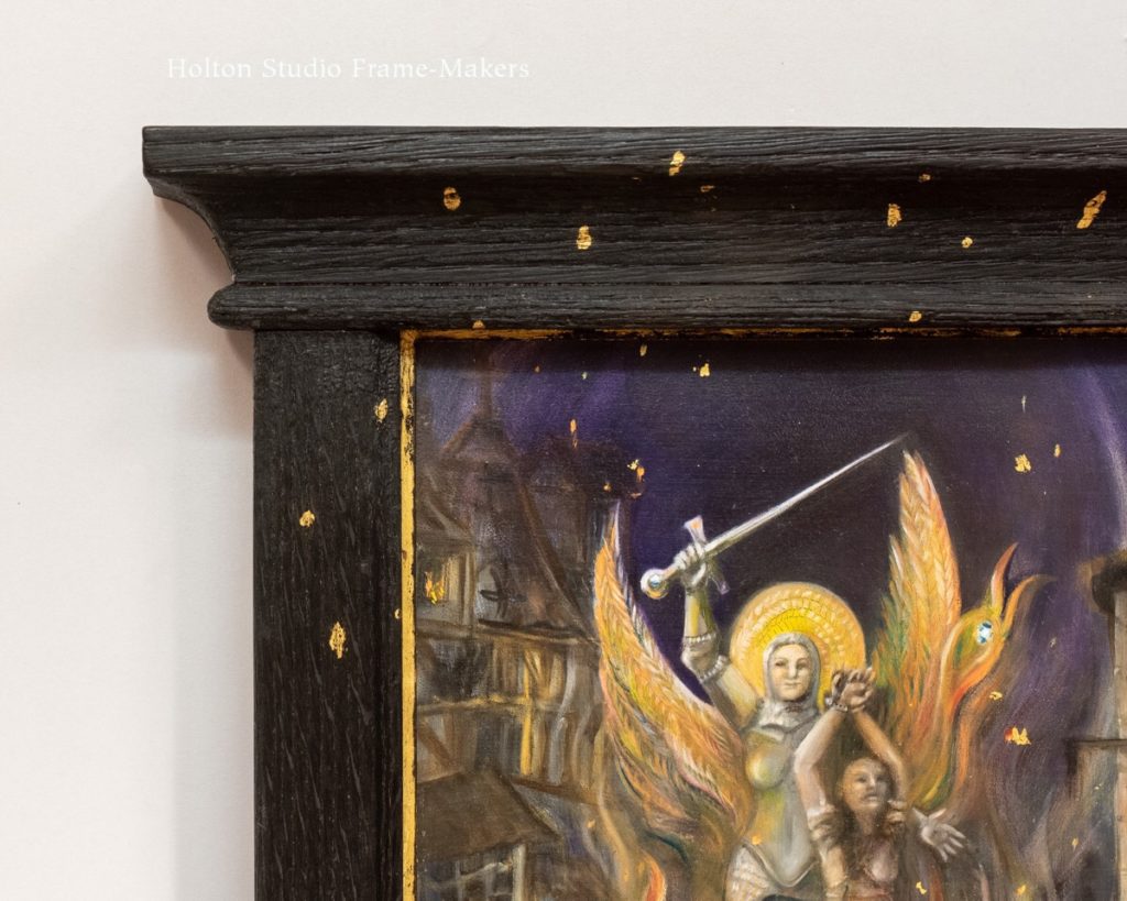
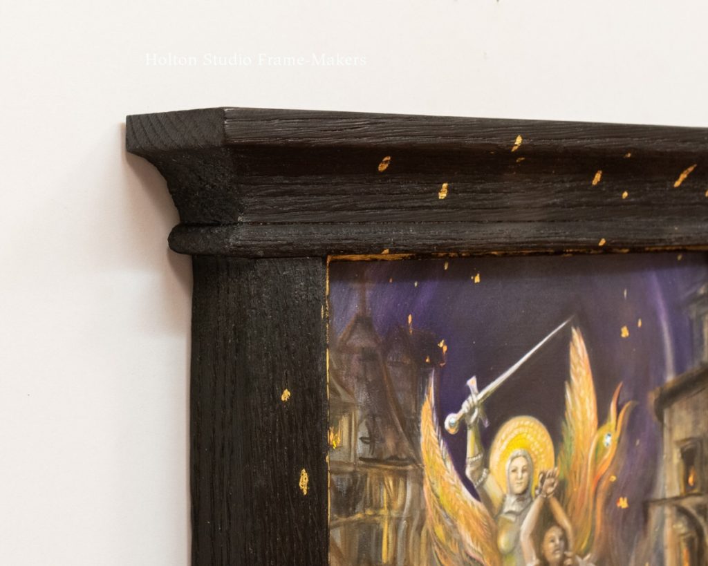
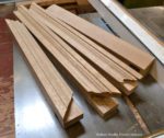
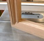
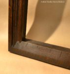
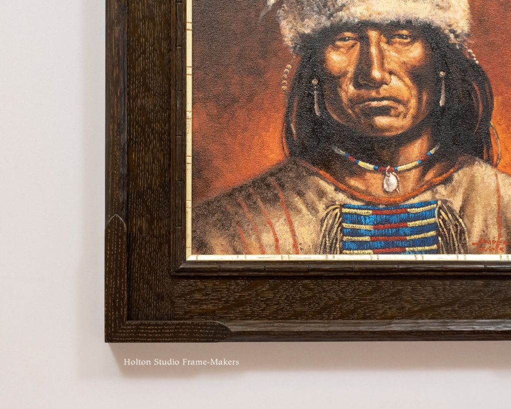
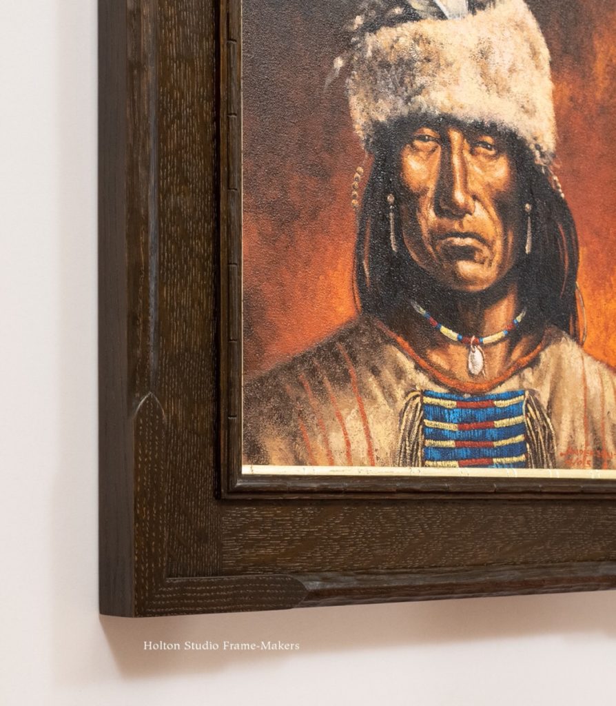
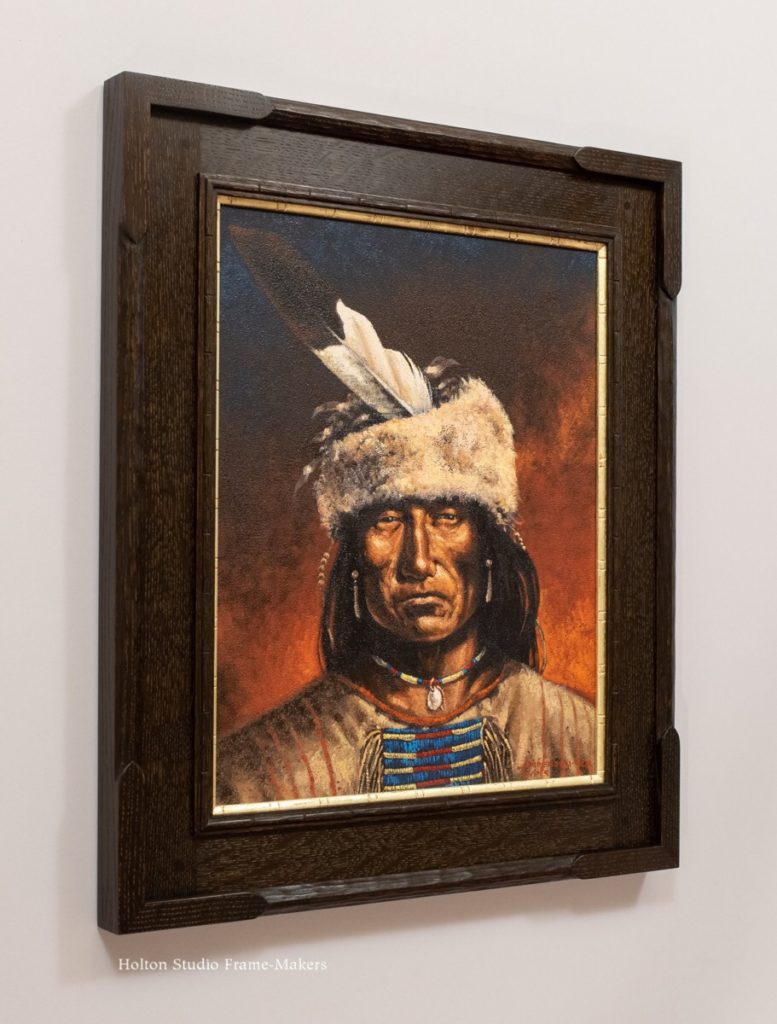
Framing Karima Cammell
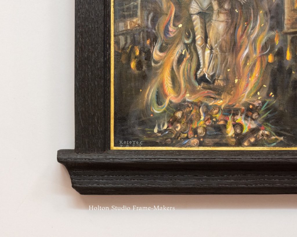
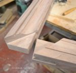
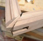
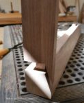
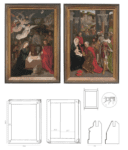
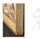
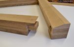
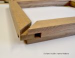
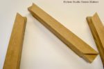
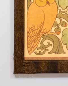
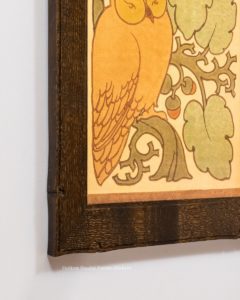
Karima Cammell’s paintings are tremendously rewarding to frame. I’ve largely assumed that’s because of the way they’re painted—the particular way Karima uses line and form—as well as the architecture and other decorative arts that populate them and express a profound regard for all the arts and their unity. These aspects of her work welcome the art of the frame-maker and are completed by it.
But reading the artist’s statement for the show makes me realize that another reason framing her work is so rewarding may have to do with “the power of transformation,” she speaks of—“the age-old magic that makes us human”—to which she adds the power of imagination. For imagination, including a work of imagination like a painting, is transformative—it transforms reality. And for a work of imagination that is a painting, the first encounter with reality is the architectural setting, beginning with the frame.
So I wonder if, of all the traits that make Karima’s work so welcoming to the frame, it’s the evident plea of a human soul in a distressed world, a plea the frame-maker is in a unique position to heed by proving the painting’s efficacy—the imagination’s vital power to affect its surroundings, to transform reality.
HIGH WATER: Works by Karima Cammell
View show page here…
Please join us for the reception, October 9th, 4–6 PM
The Holton Studio Gallery
2100 Fifth Street, Berkeley
Opening After Party at Zut! on Fourth Street—
After the reception we will stroll over to Fourth Street for wine and hors d’oeuvres in the parklet.
COVID Protocol:
- The reception will be held outdoors.
- Vaccinated guests only please.
- Masks are required inside the gallery.
- The number of people allowed in the gallery at one time will be limited to 20.
- Please RSVP so that we can keep you updated if information changes.
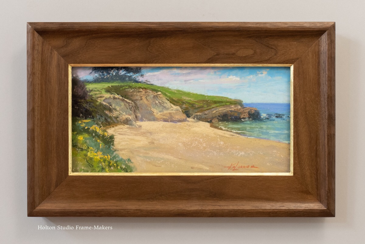
Previous posts on framing Karima Cammell’s paintings—
-
-
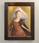
Karima Cammell, “Blue Lightning” See post…
-
-
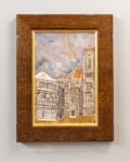
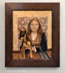
Karima Cammell, “Raphaela Hero Brown” See post…
-
-
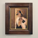
Karima Cammell, “Valentina Brown” See post…
-
-
Karima Cammell, “Self-Portrait as an Egg Tempera Painter” See post…


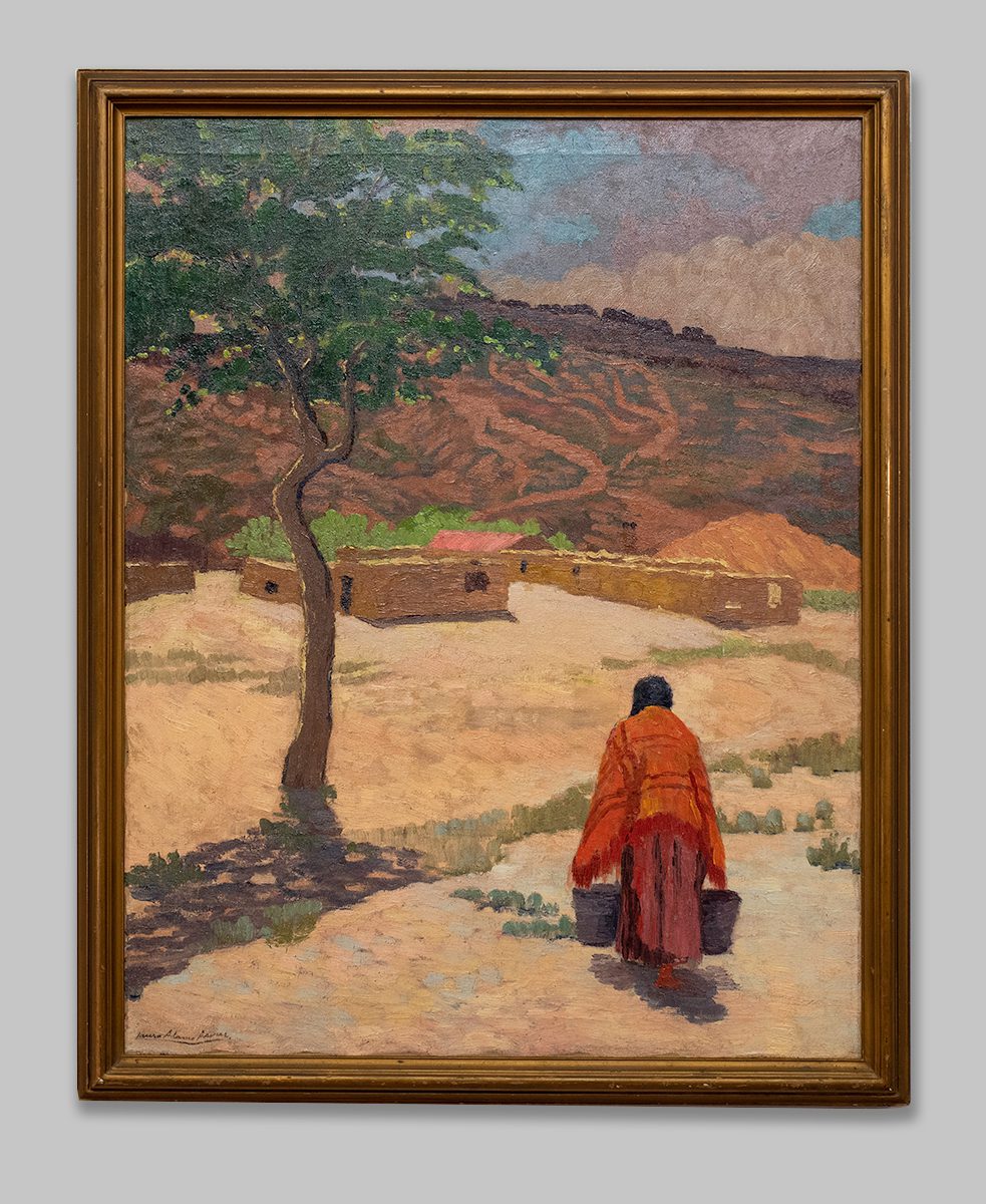
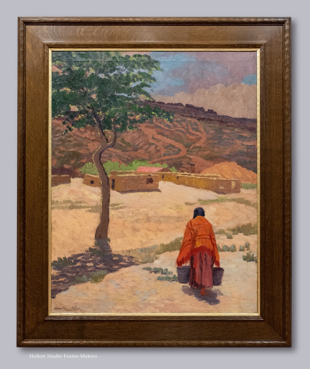
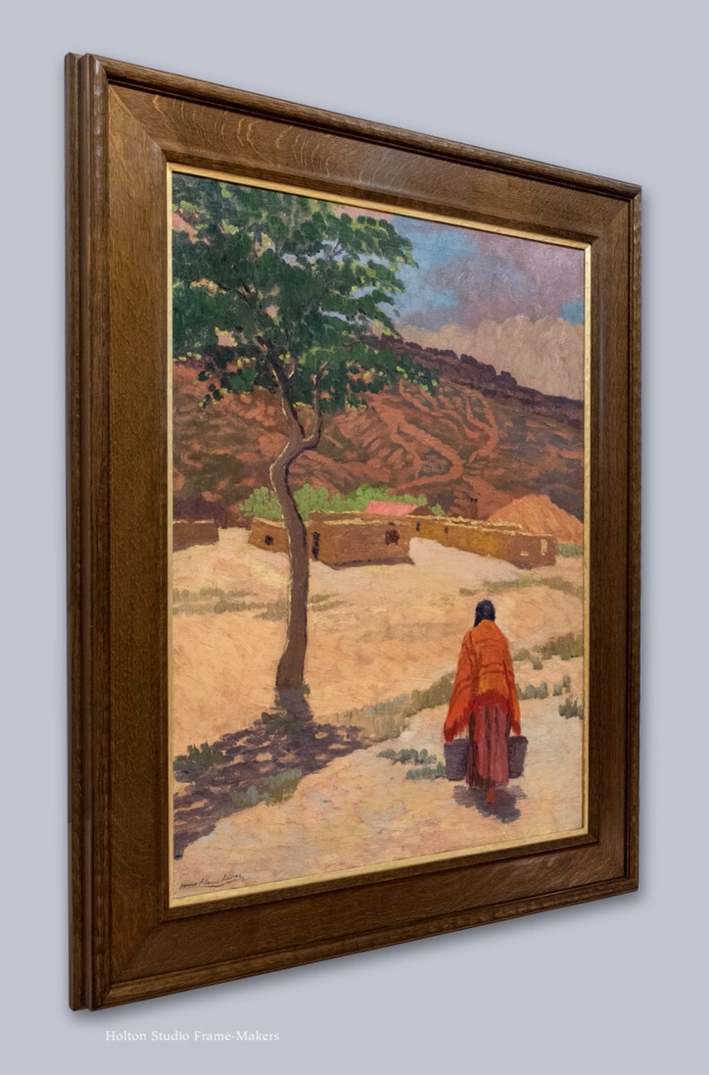
 Armer, along with some others, worked closely with Navajo singers and collected many sand paintings, often from previously unrecorded chants. Armer also made what was probably the first movie of an actual ceremony in February 1928 (Armer 1956, 1961). It was filmed on the sixth day of a nine-night Mountainway ceremony, at the hogan of Hosteen Tsosie near Ganado under the direction of Na-Nai. The movie cost trader Roman Hubbell $15,000 to produce exclusive of goods and gifts. (Everyone who participated in the ceremony had to be given gifts to lessen the opposition.) This film was shown at the International Congress of
 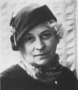 Americanists in 1929, the American Anthropological Association meeting in 1930 and to numerous civic and women’s groups around the country. It greatly expanded Anglo knowledge about Navajo religion. Armer also made a short film of a star gazing divination rite in 1929, which included two sand paintings.