Framing Heinrich Carl’s “The Oakes”

Another “printable” frame for a woodblock, as was the frame in my last post. This one’s for a print made around 1920 by the little-known Heinrich Carl. The image size of “The Oakes” is about 10-1/2″ x 8″. For its muted palette, we used a brown solid core rag mat, and a lightly stained carved walnut frame, 1″ wide, with a narrow slip painted to match the green in the print.

—Tim Holton

Framed woodblock print by Heinrich Carl

A Frame Is a Kind of Flower: Framing Margaret Patterson’s Anemones

This is a colored woodcut titled “Anemones,” (ca. 1920, 9-3/4″ x 6-7/8″) by New England print maker and painter Margaret Jordan Patterson (1867-1950).

Margaret Jordan Patterson, photo

Margaret Jordan Patterson

The 1-1/8″ wide frame is cherry with a deep red-brown stain matching the blossoms’ clustered anthers. It has a carved slip painted in the print’s darkest blue. The design is in one way typical of what I like to do with block prints—carving a flat frame in the same fashion as the carved woodblock used to make the print. I call these “printable” frames. My craftsman’s understanding of the nature of the frame has led me to emphasize the frame’s joinery, its corners, as points of power and significance. But centers of the frame’s members also have their power and significance in relation to the composition of the picture the frame serves. In this case, Patterson’s frankly centered arrangement strongly suggested the centers of the frame’s sides are where I should place a decorative accent, mimicking Patterson’s anemones with a floral touch.

Framed for California Historical Design.

See other Margaret Patterson block prints we’ve framed…

—Tim Holton

Framed Margaret Patterson block print Framed Margaret Patterson block print Framed Margaret Patterson block print—detail Framed Margaret Patterson block print—detail


Final Week of Our “Superbloom of Local Talent”

Our current show, “California Wildflowers,” enjoyed some publicity and lavish praise in last week’s issue of our local print paper, The Berkeley Times. Reviewer Todd Kerr called it “a superbloom of local talent,” and “eye-dazzling.” Maybe we should get one of those lit-up Broadway-style theater marquees out front for showing off such critical acclaim! In any case, below are are three paintings the paper picked out as favorites.

The show closes this Saturday, so if you haven’t seen “California Wildflowers” yet, don’t let this “must-see exhibit” pass you by!

—Tim Holton

Framed Terry Miura painting

Terry Miura
“California Brittlebush”
Oil on panel, 12″ x 12″. $2,000 framed.
BUY

Framed Christin Coy painting

Christin Coy
“Springtime – Giacomini Barn, Pt. Reyes Station”
Oil on canvas, 9″ x 12″. $1,550 framed.
BUY

Framed James McGrew painting

James McGrew
“Pacific Dogwood and Bridalveil Fall”
Oil on panel, 11″ x 14″. SOLD

Framing Dard Hunter and the Roycrofters

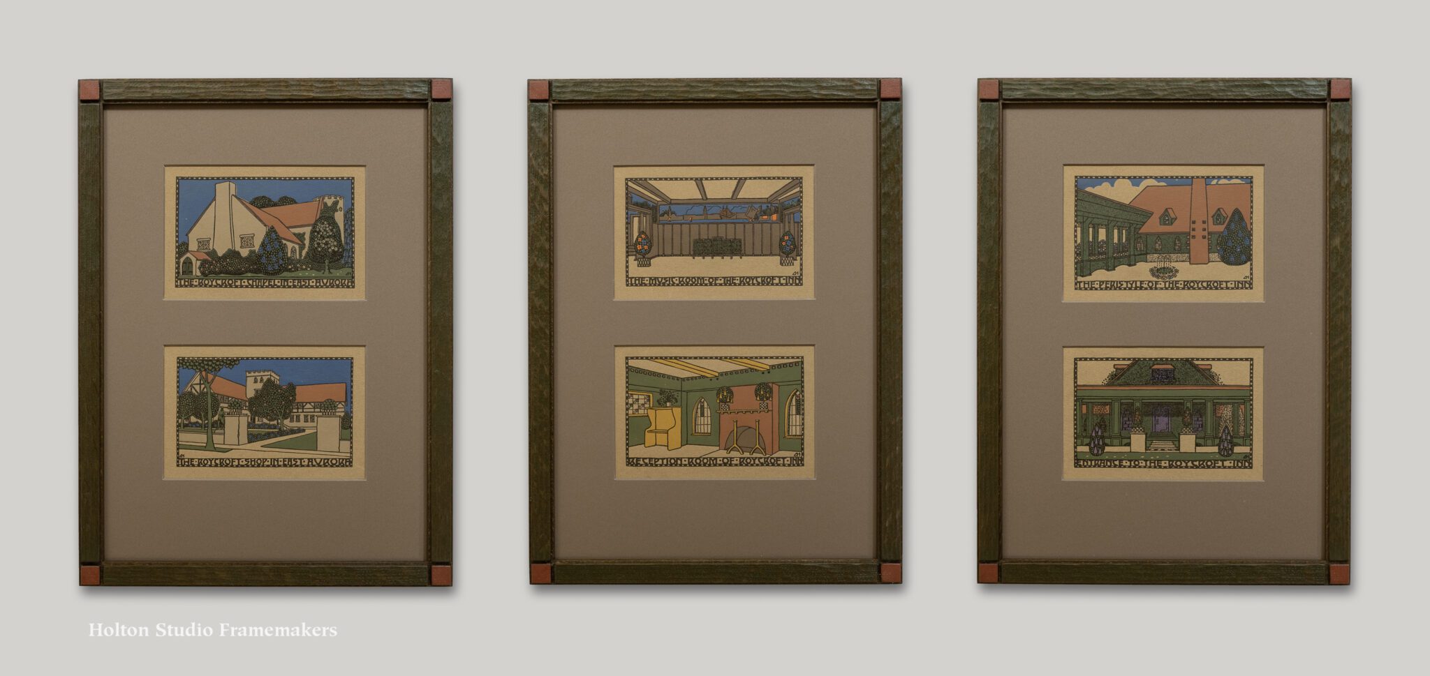
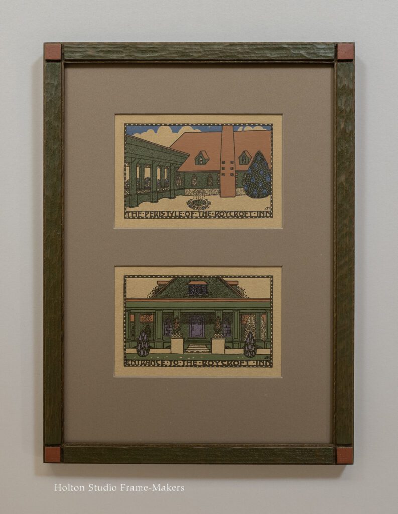
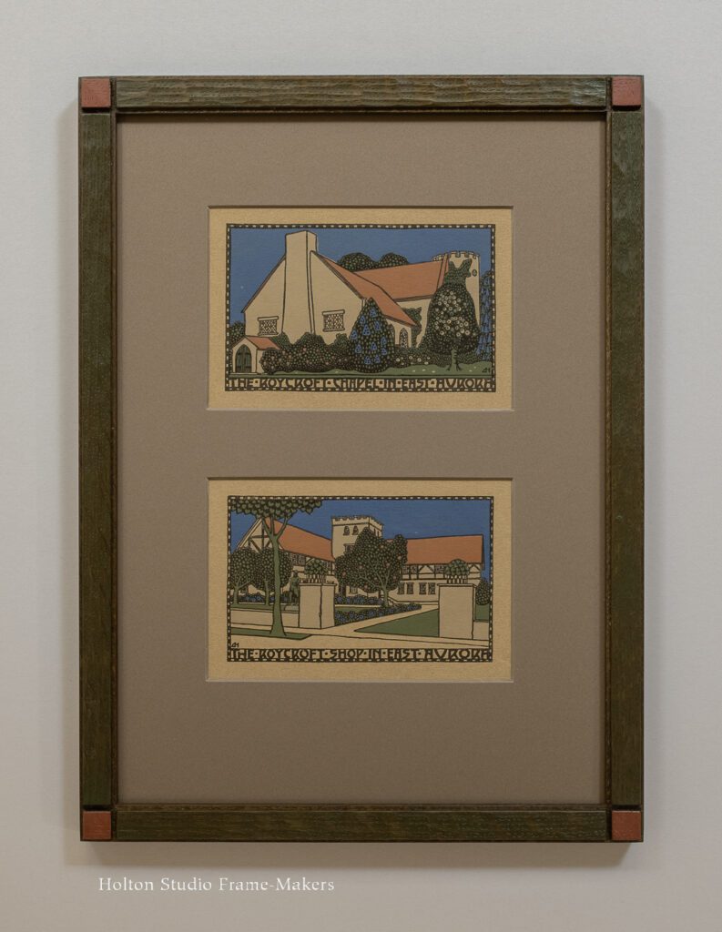
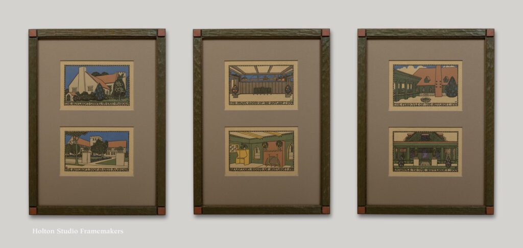
This is a set of six hand-colored prints by Dard Hunter (1883-1966), framed in pairs. Made in 1909-1910, they depict the architecture of the Roycroft campus in the heyday of the Arts and Crafts Movement. Dard Hunter was a major Arts and Crafts figure, especially in the realms of graphic design and printing. Picture frame corner sampleSo for me, as a great believer in that movement, it was a treat to get to frame these.

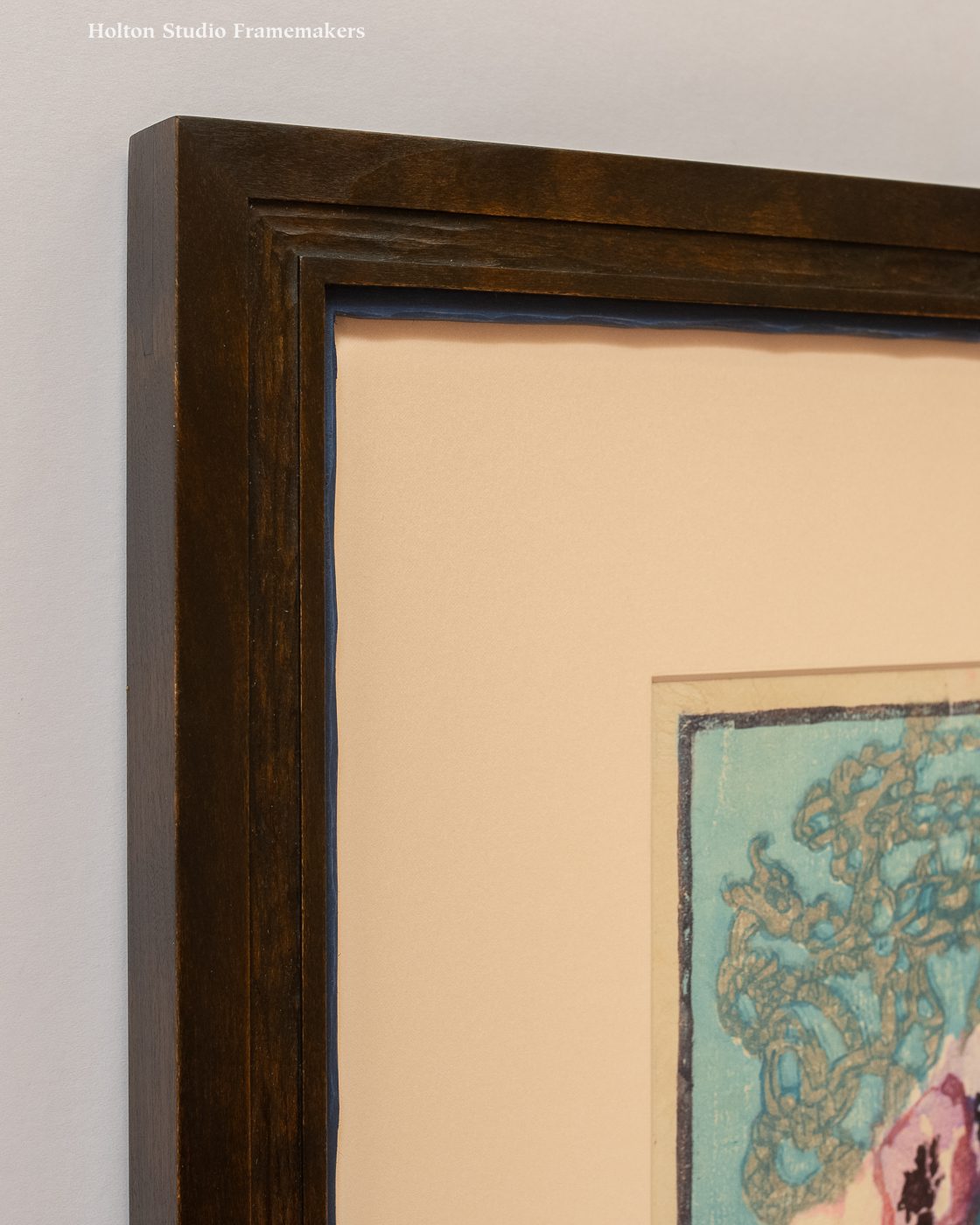
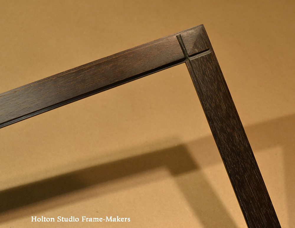
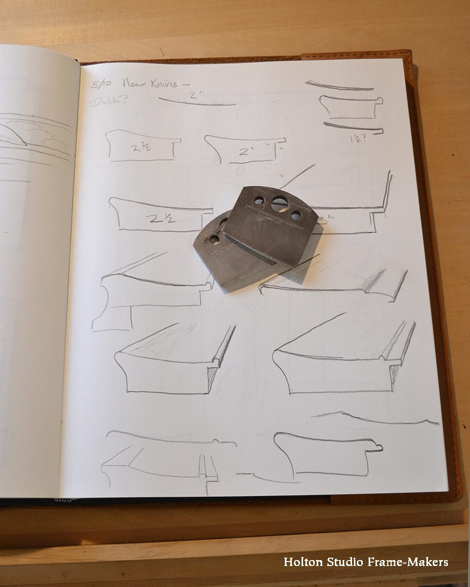
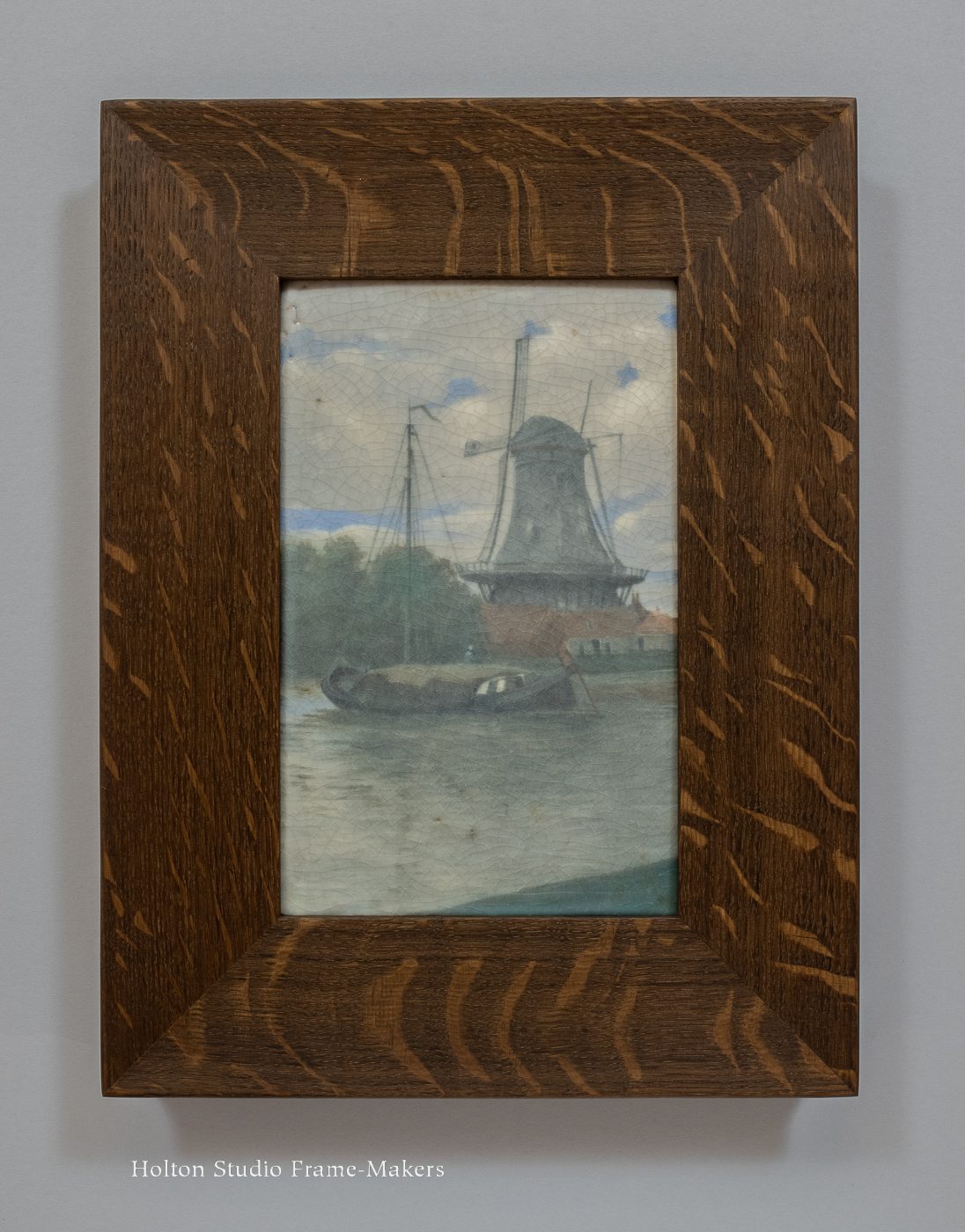
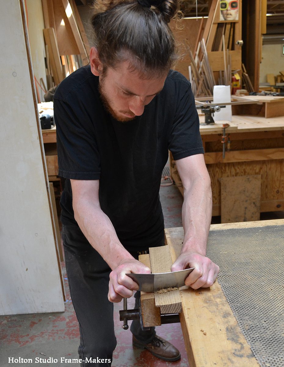
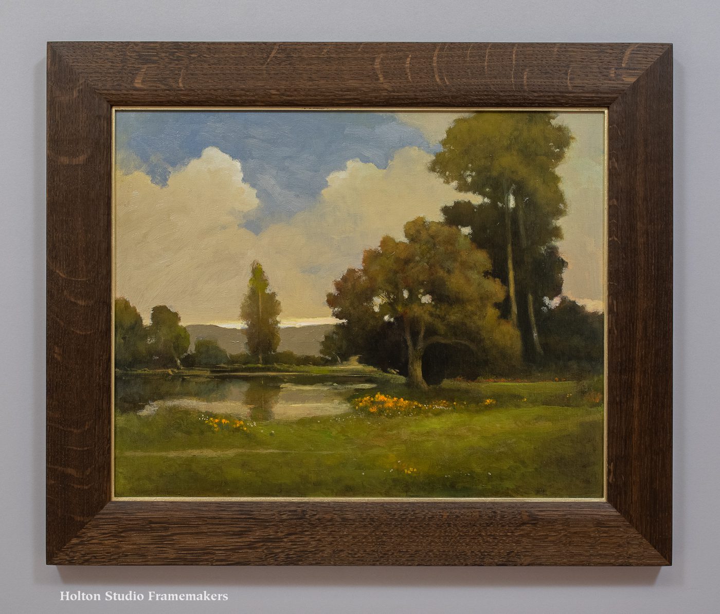
Each image is about 3-1/4″ x 5-1/4″. The fumed quartersawn white oak frames are 3/4″ wide. Their outside dimension are 15″ x 11″. The frame design follows the obvious cue provided by Hunter’s borders of little squares. The profile is our No. 15, which we embellished with some carving and painting: squares carved at the corners (a simpler version of this design is shown at right), the panels between the corners gouged for some texture, and then those panels and the corner squares painted in complementary green and red to celebrate Hunter’s vivid coloring. Trevor made the frames, and Sam and Avi finished them.
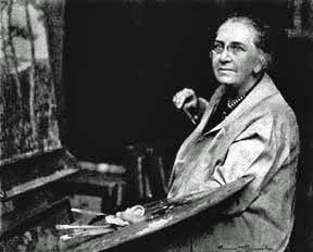
Set of framed Dard Hunter prints

Dard Hunter

Dard Hunter

Dard Hunter III of Dard Hunter Studios writes that in 1903, his grandfather’s eyes were opened to Arts and Crafts architecture by a stay at The New Glenwood Hotel—now The Mission Inn—in Riverside, California. Soon after, he offered his services to the prominent Arts and Crafts leader Elbert Hubbard and joined Hubbard’s Roycroft community in East Aurora, NY. There, swept up in the spirit of the movement, he explored a range of arts, including furniture, stained glass, pottery, and jewelry, as well as the book arts he would later focus on, securing for himself an enduring legacy as one of the most important modern figures in that field. (In his lifetime, he wrote an incredible twenty books on papermaking, for example.)

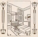
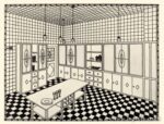
Hunter also took to perusing “journals such as Deutsche Kunst und Dekoration, gaining a sense of design in the Viennese fashion,” according to Dard III. When Hunter married pianist Edith Cornell in 1908, “he was so enamored with the work of Josef Hoffman and the Wiener Werkstatte that they spent their honeymoon in Vienna. For the next few years, Hunter incorporated the geometric patterns and highly stylized figures into his work with the Roycrofters.” You can see the influence on Hunter of Hoffman’s interior drawings shown at the bottom of the post.

These prints, then, are an important expression of international cross-fertilization in the history of the Arts and Crafts Movement in America. They also point to the significance of architecture in the Movement, and its place at the heart of Arts and Crafts ideals—the mother of the arts under which they are all practiced. Framing depictions of architecture always carries special opportunity for harmony between the pictorial subject and the architecture of the frame. But in the case of these images of the iconic Arts and Crafts campus of the Roycrofters, imbued as it is with the unifying ethos of the Movement, that’s especially true.

Below are interior designs by Hoffman, clearly showing his influence on Hunter. In particular, note Hoffman’s fondness for patterns of squares.

Learn more about Dard Hunter at Dard Hunter Studios. (Dard III’s excellent short biography is here.) If you’re ever in the vicinity of Chillicothe, OH, south of Columbus, it’s worthwhile visiting Dard Hunter’s home, Mountain House to see the wonderful museum Dard III has set up in tribute to his grandfather.

Learn more about the Roycroft community here and here. And watch PBS’s “Head, Heart, and Hand: Elbert Hubbard and the Roycrofters.”

—Tim Holton

A New and Very Subtle Profile

Here’s a key lesson I learned a long time ago when I started looking closely at early twentieth century oak frames: while the shape of a frame molding should be alive to the picture, subtlety is Period Oak framescrucial to keeping the frame in its subordinate role. Following the example of the best Arts and Crafts era frame designers, we therefore typically flatten frame forms and elements a bit in deference to the flat plane of the picture and the flat wall the frame connects the picture to.

A good example of such a molding shape is a new profile we call No. 300 BC Low, which we just had knives made for. (These fit a molding head we use on a table saw.) The idea is to make the flattest perceptible concave molding shape. I’d call this a “dish” in contrast to a more pronounced scoop or cove. Of course the shape of the profile should always at the same time echo shapes rendered in the picture. But the subtlety adds another benefit having to do with harmony: it is by virtue of its contrast to the complementary adjacent flat picture and wall that the shape reads. If it were more dramatic, it wouldn’t need the juxtaposition to a contrasting flat plane for our eyes to Sketchbook page with molding knivesregister its character. Its interest, in other words, isn’t in the frame alone, but in its interdependent relationship with those flat forms. Flatness and 3-dimensional form complement—that is, they complete—each other. They need each other.

Just that slight curve, along with the cut-in back, gives the profile grace and makes it feel much lighter than a plain square molding, like the No. 1, at the same width.

We made the No. 300 BC Low corner sample below in fumed quartersawn white oak finished with linseed oil and wax. The knives are 2″ wide, and that’s the width of this sample, but they can also be used to mill a narrower molding or as part of a wider profile, either by adding other elements or simply stretching out the flat. In the photo at left, showing the knives on a page of my sketchbook, you can see how I’ve begun drawing possible profiles using these knives, often combined with other knives.

Corner sample, No. 300 Low—2"

Tia Kratter‘s “Rebirth” (below), which is in our current show “California Wildflowers,” cried out for just such a profile, so it received our first frame made with the new knives. The shape suits not only the broad flat field but also the distinctive long gentle curves of poppy pedals.

Tia Kratter painting

We made Tia’s frame, above, in walnut. As I said, because the cove goes to flat, that portion can be stretched out to make profiles wider than 2″—which is what we did for the fumed quartersawn white oak frame on the 1912 Carl Schmidt Rookwood tile, below. This piece offered the perfect opportunity to echo the forms of the boat and the windmill while staying subordinate to Schmidt’s quiet and muted treatment of the scene.

Framed Rookwood tile

Those wonderful old frames inspired by the Arts and Crafts Movement came out of a special understanding of the natural unity and harmony of the arts, and in particular between pictures and architecture. Nineteenth century frames had become absurdly ostentatious and pretentious, reflecting an increasingly arrogant position and status for painting as separate from the other arts. Reformers turned to a humbler presentation of pictures, and relied on simpler frames, frequently made in beautiful oak, to restore pictures to a more harmonious role as just one of the many allied arts—no one of those arts standing alone but each made more beautiful by its complementary relations to the others and its service to the whole architectural setting.

—Tim Holton

Craftsman using a scraper

Avi Shorer using a scraper on the face of our new No. 300 BC Low corner sample.

Framing Paul Roehl for “California Wildflowers”

We had a great opening last Saturday for our latest show, “California Wildflowers.” Gallery openingMany of our artists were able to come, including Paul Roehl. Paul has this lovely 16″ x 20″ oil on panel in the exhibit, “Spring, Coast Range”. The frame, made in fumed quartersawn white oak finished with linseed oil and wax, is a 2-1/2″ wide flat with a soft carved cushion-shaped sight edge that rolls down to the painting and echoes its soft forms and textures. 18kt gilt slip.

Available here…

“California Wildflowers” is showing through August 3. Please come by to enjoy it—and consider making the beauty of California’s flowering spring landscape a part of your home year-round! The show can also be viewed online, here and here.

—Tim Holton

Paul Roehl painting

Paul Roehl, “Spring, Coast Range”. Oil on canvas panel, 16″ x 20″. $4,200 framed.
BUY

Paul Roehl painting

“California Wildflowers” Opens Today!

Our new show, simply titled “California Wildflowers,” opens today! After a refreshingly wet winter, California enjoyed a lush and brilliant spring. In this show, eighteen painters celebrate that revitalizing season and its blossoms.

Below is one of the thirty-five paintings, “California Superbloom,” an 18″ x 24″ oil on canvas by guest artist Inga Poslitur (right). It’s framed in a quartersawn white oak (Medieval Oak stain) No. 1—3-1/2″ with proud splines pinned with six dowels at each corner.

You’ll have a chance to enjoy much more of Inga’s work later this summer, when we host “Inga Poslitur: New Paintings,” August 10 – September 14.

Today’s opening reception for “California Wildflowers” is from 2 to 4. I hope you’ll come! You can also view the entire show online here and here.

—Tim Holton

Inga Poslitur paintingInga Poslitur painting

Framing Erik Tiemens for “California Wildflowers”

In our latest exhibit, “California Wildflowers,” which opens this weekend, eighteen painters celebrate our beautiful state at its most beautiful—in bloom! Erik Tiemens is represented by this stunner, “Reaching the Top” (oil on canvas, 18″ x 24″), painted this spring (of course) at China Camp State Park in Marin County. With Erik’s masterful handling of the light, a path invites us to wander a green hillside dotted with poppies, toward a vista on San Pablo Bay. The 3″ flat mitered frame is in fumed quartersawn white oak with a narrow parcel gilt sight edge chamfer.

The opening reception for the artists is this Saturday from 2 to 4. I hope to see you there. Also we will be posting the show online here and on our online store. “California Wildflowers” runs through August 3.

—Tim Holton

Erik Tiemens painting

Erik Tiemens, “Reaching the Top,” 2024. Oil on canvas, 18″ x 24″.Erik Tiemens painting


Framing a Toshi Yoshida Abstract Print

This frame design came to me one day a year or two ago while noodling in my sketchbook, and I made a corner sample of it.Mabaroshi print, framed Shortly after, it came in handy for this 19th century oban size print, “Illusion”, at right, by Utagawa Kunisada (1786-1865). I liked the way it repeated the lines in the kimonos. It’s a plain 5/8″ wide square profile in walnut stained black, but with shaped corners. A red painted slip accented the shape, and further harmonized the print and frame.

That same corner sample recently proved useful for a much later and very different Japanese print, shown below. Hiroshi Yoshida (1876-1950) and his son Toshi Yoshida (1911-1995) are among the great 20th century Japanese woodblock artists. Toshi generally followed in his father’s footsteps, favoring naturalistic images of landscapes and animals (like this great example). But a couple of years after Hiroshi’s death in 1950, Toshi experimented with abstraction, distilling his imagery down to basic elements like—as in this case—line and form. He made this print, “Dragon A,” in 1955. We gave the 11″ x 19-1/2″ image an ample 3″ mat (3-1/2″ bottom), and finished the setting with the flaired corner design, 1″ wide, also walnut stained black, but this time left on its own, without the slip, and so more suitably bold.